Visual Identity Design: The Complete 2026 Guide
Key Takeaways
- Visual identity design is the strategic process of crafting visual elements like logos, colors, and typography to create a cohesive brand appearance.
- Consistent visual identity increases brand recognition and builds consumer trust over time.
- The visual identity design process typically follows six key steps, from brand analysis to guideline creation.
- Leading design platforms like Dribbble and Behance host tens of thousands of visual identity projects, offering serious inspiration for brand teams.
- AI tools like Canva AI and Adobe Firefly are speeding up the early stages of visual identity design, though human judgment still drives the final call.
- B2B and B2C brands need fundamentally different visual approaches to connect with their audiences.
Visual identity design is the strategic process of building a cohesive system of visual elements, including logos, typography, colors, and imagery, that expresses a brand’s personality. It keeps recognition consistent across every touchpoint a customer sees.
What Is Visual Identity Design?
identity design is the collection of visual components that give a brand a recognizable face. The American Marketing Association, as cited by Canva, defines brand identity as the “visual and symbolic elements that represent a brand.” That definition goes well past a logo. It covers the entire visual language: color schemes, typefaces, imagery style, and increasingly, motion graphics. In a crowded feed, this type of design is doing the talking before your copy ever gets read.
“Design is the silent ambassador of your brand,” legendary designer Paul Rand once said, a line that still sums up why visual consistency matters more than any single clever asset.
The Role of Visual Identity in Branding
Brand identity covers the core values, mission, and personality of a company. this kind of design is what makes that identity tangible, the part customers actually see and remember. Design platform Dribbble hosts more than 75,844 visual identitys from working designers worldwide, and Behance lists over 10,000 visual identity projects in its own archive. That volume alone tells you this discipline isn’t a side task, it’s a full creative practice.
Why Invest in Visual Identity Design?
A strong identity design builds recognition and trust simultaneously. It creates emotional shortcuts that simplify how customers decide who to buy from. When every visual touchpoint feels consistent, the brand becomes shorthand for a specific experience, which cuts down on decision fatigue and boosts recall. For businesses, that translates into stronger loyalty and marketing campaigns that don’t have to work as hard to be remembered.
The Core Elements of Visual Identity Design
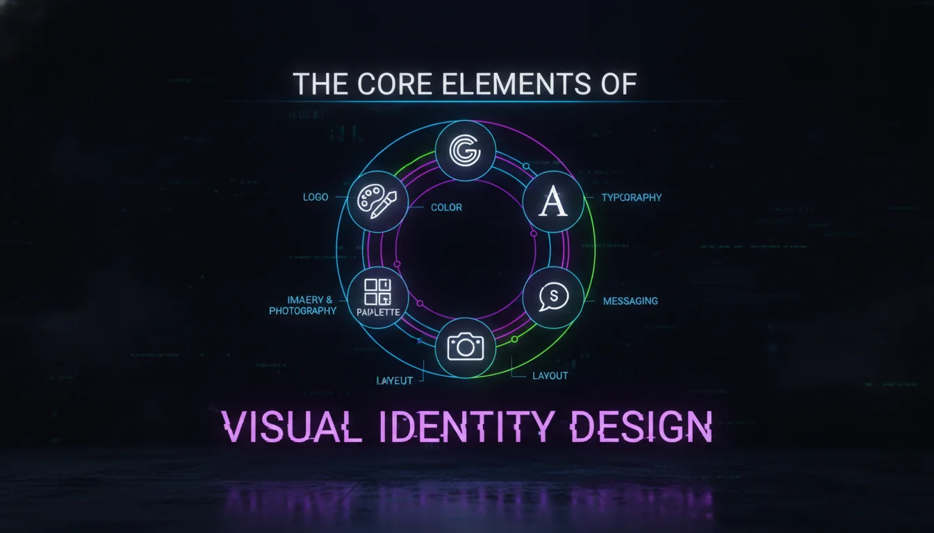
Most frameworks, including the one outlined by Adobe, break visual identity into five components: logo, typography, color palette, imagery, and tagline. Each carries its own weight in building a presence people trust on sight.
The Role of Logos
A logo is a simplified visual mark that acts as the primary identifier of a brand. It needs to be distinctive, scalable, and true to what the brand stands for. Within this type of design, the logo anchors every other element, showing up on everything from business cards to app icons. The strongest logos, think Nike’s swoosh or Apple’s silhouette, get recognized instantly, with or without the name attached.
Choosing Typography
Typography is the fonts and typefaces used across brand communications, and it sets tone the same way a voice does in conversation. It can read modern, classic, playful, or serious depending on the choice. Inconsistent typography fragments a visual identity fast, confusing audiences about who’s actually talking. A well-chosen typeface becomes as recognizable as a logo over time, reinforcing personality every time it appears on screen or in print.
The Psychology of Color
Color palettes shape emotion and perception before a viewer reads a single word. this kind of design leans on a primary and secondary color scheme to keep everything aligned and intentional. Blue tends to signal trust and professionalism, which is why financial institutions gravitate toward it, while red pushes energy and urgency, common across food and entertainment brands.
Imagery and Photography
Imagery, whether photography, illustration, or graphic style, needs to consistently reflect the brand’s values and messaging. Custom photography or a defined illustration style both work, as long as the choice stays consistent. These visuals add context and emotional depth, turning an abstract brand promise into something a customer can actually feel.
The Power of a Tagline
A tagline is a short phrase that captures the brand’s essence in a handful of words. It usually sits beside the logo, reinforcing the promise the visuals are already making. In visual identity, the tagline gets woven into layouts and campaigns, giving the verbal brand a partner for the visual one.
| Element | Role in Visual Identity | Best Practice |
|---|---|---|
| Logo | Primary brand identifier; anchors all visuals | Keep it simple, scalable, and timeless |
| Typography | Sets brand tone; ensures readability | Limit to 2-3 complementary fonts |
| Color Palette | Evokes emotions; builds recognition | Choose a primary color + 2-3 secondary colors |
| Imagery | Reinforces brand story; adds depth | Maintain a consistent style (e.g., flat illustrations, realistic photos) |
| Tagline | Communicates brand essence in few words | Keep it short, memorable, and aligned with values |
The 6-Step Visual Identity Design Process
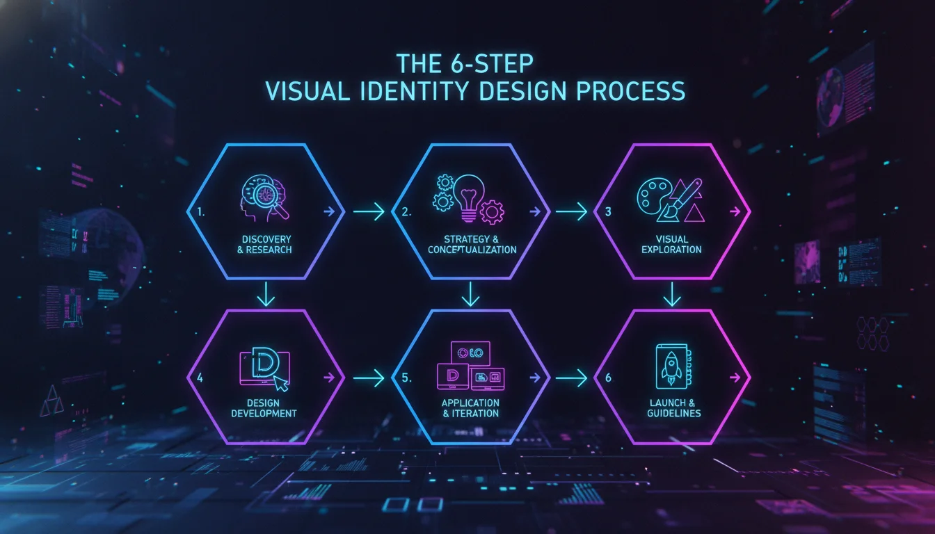
Building a visual identity that actually works follows a systematic process, usually broken into six stages. This structure keeps the final result strategic instead of just decorative.
Step 1: Understand Your Brand’s Core Identity. Start by getting clear on the brand’s mission, values, target audience, and what makes it different. This groundwork informs every design decision that follows, so skipping it shows up later as an identity that feels hollow.
Step 2: Research Competitors and Industry Trends. Study competitors’ visual identities to spot common patterns and find room to differentiate. Dribbble and Behance are useful here, offering a real-time view of what’s trending and what’s already overdone.
Step 3: Define a Brand Strategy. Turn your research into a clear point of view on positioning, personality, and key messaging. This strategy becomes the blueprint for identity design, keeping visuals tied to actual business goals instead of personal taste.
Step 4: Design the Core Visual Elements. Build the logo, select typography, develop the color palette, and set imagery guidelines. Iterative feedback loops with stakeholders sharpen these elements until they actually capture the brand’s essence, not just a designer’s mood board.
Step 5: Build Comprehensive Brand Guidelines. Document every decision in a brand style guide, including logo usage rules, color codes (HEX, RGB, CMYK), typography hierarchy, and image styles. A clear guide is what keeps consistency intact across a team that’s bigger than one designer.
Step 6: Implement and Evolve Over Time. Roll the new identity out across every touchpoint, website, social profiles, stationery, signage, and pay attention to how the audience responds. Even established brands like Lloyds Bank have refreshed their visual identity to stay current, a point Column Five Media makes in its curated look at 15 standout visual identities.
Visual Identity Design Examples
Real brands make the concept concrete faster than any framework can. Here’s how a few pulled it off.
Klarna: Making Finance Approachable
Klarna’s visual identity leans on bold typography, expressive icons, and soft pastels to feel playful and human. That softening of a typically stiff industry builds trust and makes a complicated service feel simple, proving even “serious” categories can benefit from approachable design.
Headspace: Mindfulness Through Simplicity
Headspace uses friendly, hand-drawn illustrations and gentle color palettes to evoke calm. The consistent visual language across its app, social channels, and merchandise reinforces its promise of reducing stress, which is a big reason it’s become one of the most recognizable names in wellness.
DocuSign: Professionalism Meets Modernity
DocuSign relies on clean layouts, geometric shapes, and a restrained blue palette to signal efficiency and trust. Its visual identity reads as reliable without tipping into cold or corporate, which is exactly the balance a broad professional audience responds to.
These examples, pulled from Column Five Media’s breakdown, all point to the same lesson: this type of design only works when it’s tightly linked to brand strategy, not treated as decoration layered on top.
B2B vs. B2C Visual Identity Design
Do B2B and B2C brands need different visual identities? Yes, the fundamentals stay the same but the execution shifts significantly based on who’s actually buying. Getting this distinction wrong is one of the fastest ways to undercut an otherwise solid brand strategy.
B2B Design Characteristics
B2B visual identities usually lean into trust, expertise, and stability over flash. Color palettes favor blues, grays, and muted tones, while typography sticks to clean, sans-serif fonts. Imagery tends toward the literal, professional settings or abstract concept art, aiming for credibility over emotional punch. A cybersecurity firm, for example, might use dark, tech-inspired visuals to signal authority and control.
B2C Design Characteristics
B2C brands get more room to play, using vibrant colors, playful typography, and emotionally driven imagery to spark desire. Consumer names like Nike or Coca-Cola rely on bold visuals built to trigger feelings of empowerment or joy. this kind of design for B2C often includes motion graphics, animated logos, and interactive elements built to grab attention in a crowded retail feed.
Why the Distinction Matters
Choosing the wrong approach can quietly push customers away. A B2B company with an overly playful identity risks looking unprofessional, while a B2C brand with a sterile look can fail to spark any connection at all. Strategic design accounts for these differences instead of applying one aesthetic everywhere.
Integrating AI Tools in Visual Identity Design
How are AI tools changing visual identity? They’re speeding up ideation and early concept generation dramatically, letting designers explore more directions before committing to one. As of 2026, AI has moved from novelty to standard part of the creative workflow at most agencies.
AI-Powered Ideation and Generation
Platforms like Canva AI, Adobe Firefly, and Midjourney let designers brainstorm logo variations, color schemes, and image styles fast. Feed these tools a brand’s attributes and they’ll spit out dozens of options in minutes, cutting the exploration phase down significantly. A startup could realistically generate 50 logo concepts in an hour, then narrow down to the ones worth refining by hand.
Ensuring Brand Alignment with AI
AI speeds up identity design, but it can’t replace human judgment. Designers still need to curate every AI output, checking it against brand strategy, cultural context, and legal clearance. Leaning too hard on AI tends to produce generic results, and generic is the one thing a visual identity can’t afford to be.
Balancing Automation and Creativity
The strongest teams treat AI as a collaborator, not a replacement. Tools like Adobe Express templates, and Canva’s own set of 8 brand identity templates, blend AI suggestions with manual customization, keeping creative control intact while saving real time. The future of this type of design sits in that partnership between human instinct and machine speed.
According to creative industry data shared by design platforms like Behance and Dribbble, brands that maintain strict visual consistency across channels see meaningfully stronger recall than those that let their look drift from platform to platform.
Measuring the Impact of Visual Identity Design
How do you measure the success of a visual identity? Track recognition, consistency, and sentiment shifts before and after launch rather than looking for one single metric. Direct financial attribution is tough without internal sales data, but qualitative signals tell a clear story.
Brand Recognition and Recall
The whole point of a visual identity is instant recognizability. Track consumer surveys or run informal focus groups to gauge recognition before and after a rebrand. Even a quick social media poll can reveal whether a new identity is actually cutting through the noise or just blending into it.
Consistency Audits
Review every brand touchpoint on a regular schedule to confirm the visual identity is applied correctly everywhere. Brand monitoring tools can flag inconsistencies across websites, email, and social profiles before they spread. A cohesive identity builds trust; sloppy discrepancies erode it fast.
Customer Perception and Sentiment
Watch online reviews, social comments, and net promoter scores in the months after launching a new visual identity. Positive shifts in sentiment usually correlate with a well-executed design refresh. For B2B brands specifically, client feedback on perceived professionalism and modernity is worth tracking closely.
Over time, a strong this kind of design stops being a cost center and becomes a real strategic asset, one that compounds brand equity and supports long-term growth.
What Does Visual Identity Design Cost?
visual identity costs vary enormously depending on scope, from free DIY templates to agency engagements running into the thousands of dollars. A logo-only project through a freelance platform might land at the low end, while a full brand system, including guidelines, templates, and multiple asset variations, sits considerably higher. Without a fixed industry number to cite, the smartest move is gathering quotes from a handful of designers or agencies and comparing scope carefully rather than chasing the lowest bid.
A Simple Visual Identity Audit Checklist
Auditing an existing visual identity doesn’t need to be complicated, but it does need to be honest. Run through these checkpoints before deciding whether to refresh or rebuild:
- Does the logo still work at small sizes (favicon, app icon) and large ones (signage, billboards)?
- Are the same 2-3 fonts used consistently across web, print, and social?
- Is the color palette applied the same way on every platform, including HEX/RGB/CMYK consistency?
- Does the current imagery style still match the brand’s positioning, or does it feel dated?
- Do employees and vendors have access to an up-to-date brand style guide?
- Would a customer recognize the brand from a single asset with no logo visible?
Pros and Cons
Pros
- Builds instant recognition, which reduces how hard your marketing has to work to be remembered
- Creates emotional connection that generic, inconsistent branding simply can’t achieve
- Increases perceived professionalism and trust, particularly valuable for B2B and finance-adjacent brands
- Provides a reusable framework (brand guidelines) that speeds up every future design decision
Cons
- Requires upfront investment in strategy and design before any payoff is visible
- Poor execution or inconsistent rollout can actively hurt a brand more than having no identity at all
- Needs ongoing maintenance and audits, since a visual identity left unchecked drifts over time
- Overreliance on AI-generated concepts without human refinement can produce generic, forgettable results
Building a visual identity that actually holds up takes more than good taste, it takes strategy, discipline, and a team that understands both design and the business behind it. That’s the work we do daily. Contact Emin Media for a free brand consultation, and let’s build something bold together.
Frequently Asked Questions
What is visual identity design?
Visual identity design is the process of creating a cohesive system of visual elements, such as logos, colors, typography, and imagery, that represent a brand’s personality and values. It ensures consistent recognition across every platform a customer encounters.
What are the four main components of visual identity?
While frameworks vary slightly, the core components generally include a logo, a defined color palette, a consistent typography system, and a unified imagery style. Some frameworks add tagline or full brand guidelines as a fifth essential element.
How do I create my visual identity?
Start by defining your brand strategy, then design the core visual elements: logo, typography, color, and imagery. Use tools like Canva or work with a professional designer, and always document the rules in a brand style guide following a structured process like the 6-step model above.
What’s the difference between visual identity and brand identity?
Brand identity includes intangible elements like mission, values, and voice, while visual identity is the tangible, visual representation of that identity. In short, visual identity is one part of the broader brand identity.
How much does visual identity design cost?
Costs vary widely based on scope and expertise: DIY templates can be free, while professional agencies may charge thousands of dollars for a full brand system. It’s best to gather quotes from several designers or agencies and compare scope before committing to a budget.
What software is best for visual identity design?
Popular tools include Adobe Illustrator for vector graphics, Photoshop for image editing, Figma for collaborative design, and Canva for accessible template-based creation. Adobe Firefly and Canva AI now add AI capabilities on top of these existing tools.
Enjoyed this article?
Contact Emin Media for a free brand consultation and let's create something amazing together.
Get in TouchRelated Articles
Digital Marketing for Creatives: A Bold Guide
Digital marketing for creatives builds real visibility and sales. Learn strategies for social media, SEO,…
Branding & Design Agency Tips That Actually Work
Discover branding and design agency tips to choose the right partner, set clear goals, and…
Creative Agency Pitch Deck Tips That Win Clients
Master creative agency pitch deck tips that win clients in 2026. Learn storytelling, design, and…