Motion Graphics in Brand Identity: 2026 Guide
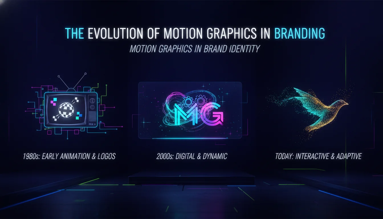
Motion graphics in brand identity are the use of animated visual elements, including moving logos, kinetic type, and dynamic color, to make a brand feel alive across digital platforms. Brands that build motion into their identity from day one communicate more, faster.
Key Takeaways
- brand identity add dynamism and emotional depth that static design simply cannot match.
- Incorporating motion from the very start of the design process leads to more cohesive, original branding outcomes.
- Dynamic elements like animated logos, kinetic typography, and sound design are essential in modern brand systems.
- Motion graphics evoke emotional connections and measurably improve brand recall across digital touchpoints.
- Effective motion branding requires genuine collaboration between visual designers and motion specialists, not a handoff at the end.
- As of 2026, motion identity guidelines are as standard in brand books as color palettes and typeface rules.
The Evolution of Motion Graphics in Branding
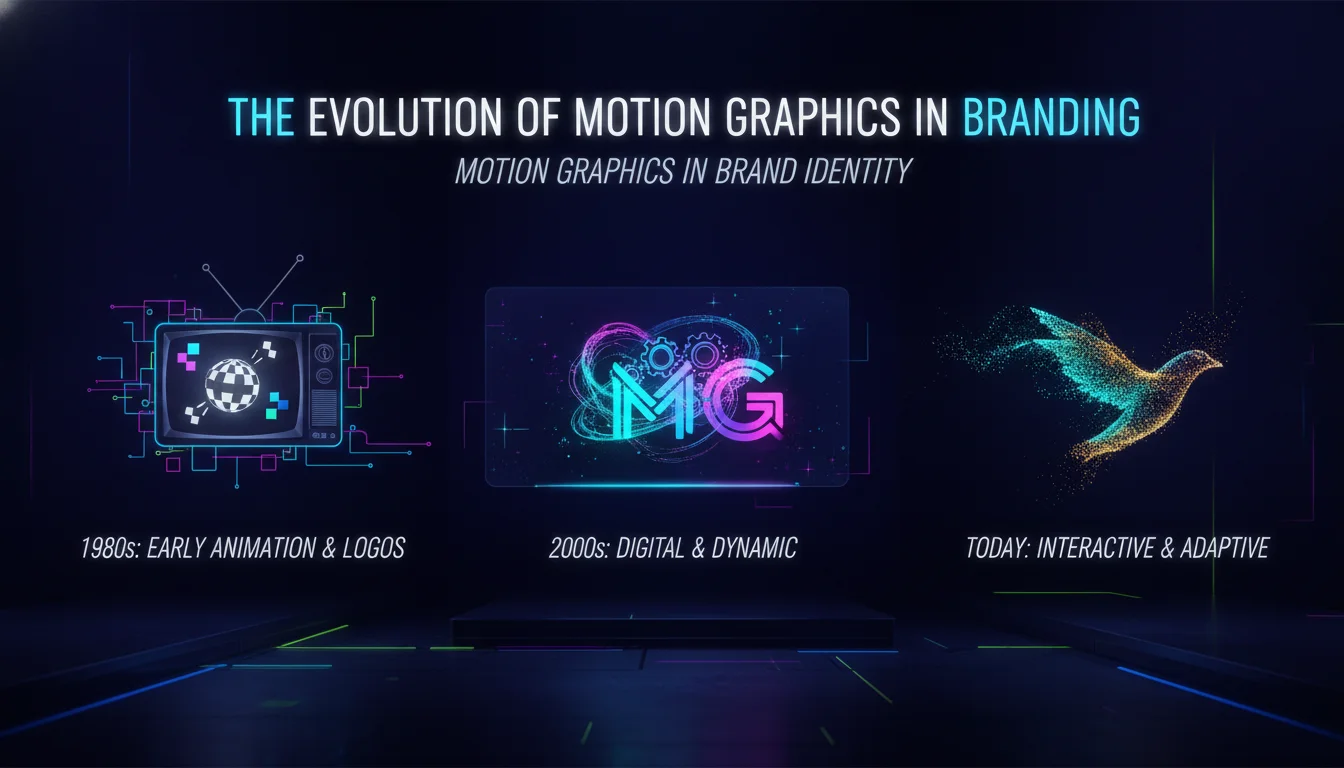
this type of identity evolved directly from the shift toward digital-first media consumption. Historically, branding relied on static visual elements: logos, typography, and color schemes printed on paper or painted on walls. The internet changed the surface area. Social platforms, video-sharing sites, and always-on screens created new contexts where static marks looked flat and lifeless.
Historical Context
Film studios and broadcast TV channels were the earliest adopters of animated brand marks, treating their logo animations as signature assets. As competitor research from logogeek.uk notes, this initially focused on logos alone, not the broader brand toolkit. That narrow view has since expanded dramatically. Today, motion governs how text appears on screen, how images enter a frame, and how brand elements interact with each other in real time.
Technological Advancements
Software like Adobe After Effects and Cinema 4D made complex animation accessible to brand designers. According to DIA’s Mitch Paone, as cited in The Brand Identity, true integration also benefits from tools like Cavalry, Houdini, and TouchDesigner, plus skills in creative coding. The toolset keeps expanding. As of 2026, AI-assisted animation workflows are shortening production timelines without replacing the strategic thinking behind motion decisions.
Changing Consumer Behavior
Faster connection speeds have made autoplay the default across every screen format. As It’s Nice That reported in January 2025, motion design now mirrors constantly shifting consumer behavior, with brands chasing audiences across portrait phones, desktop monitors, and living-room projections simultaneously. Brands that move well hold attention. Brands that stay still get scrolled past.
Key Elements of Motion Graphics in Brand Identity
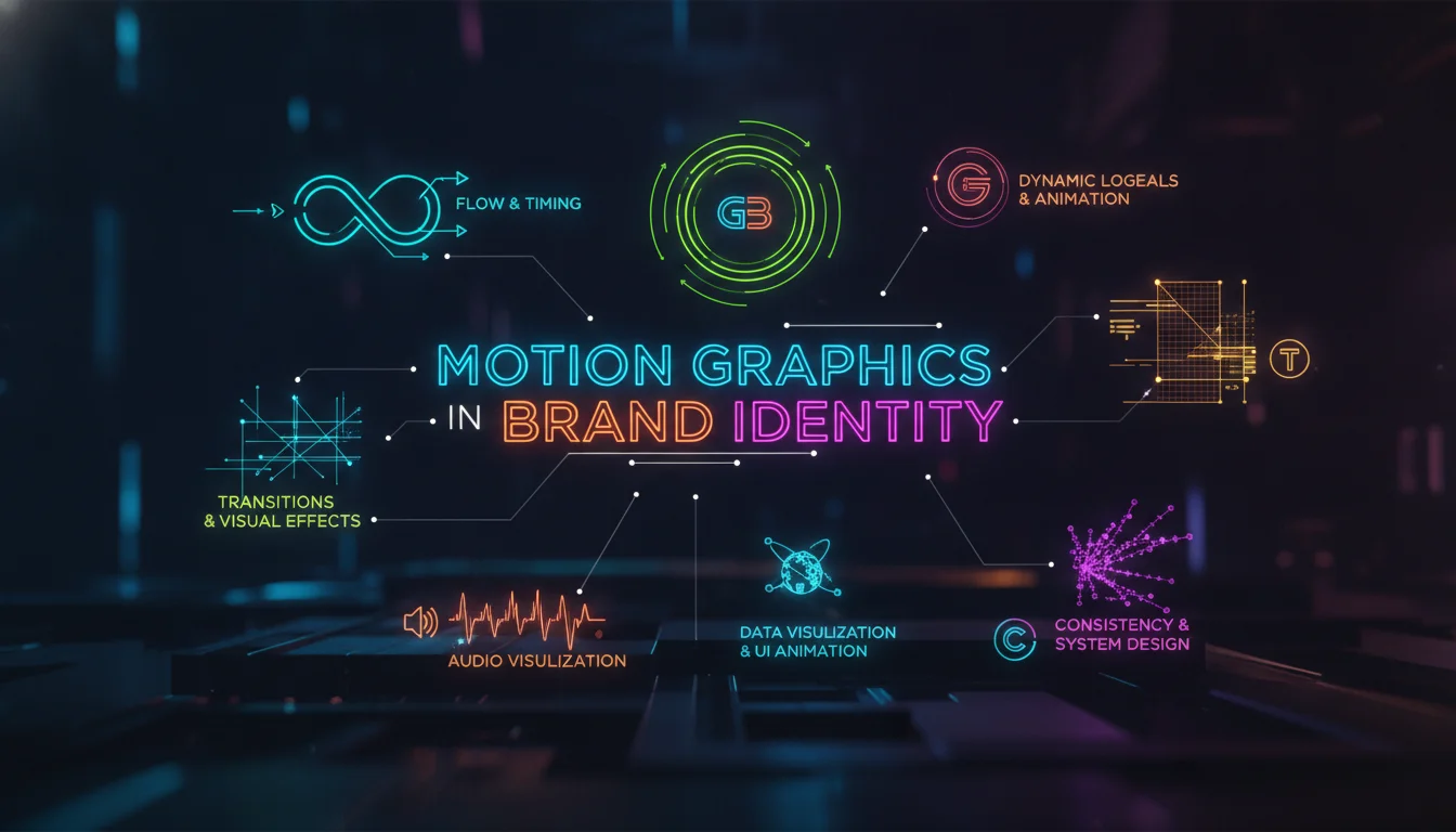
this kind of brand identity are built from several interlocking components, each carrying its own communicative weight. Understanding these elements is the foundation of any serious motion branding project.
Dynamic Logos
Dynamic logos transform static symbols into living entities that convey brand personality and values. O2, developed by Lambie-Nairn, was an early adopter: the bubble asset gave the brand a motion language that extended far beyond the logo mark itself. Google’s motion identity, developed by Google Design, links fluid animation directly to the UX, so the brand feels consistent whether you’re in Search, Maps, or Gmail.
Kinetic Typography
Kinetic typography animates text to guide viewer attention and emphasize key messages. DIA, the NYC and Geneva-based branding studio, has built an entire practice around kinetic identities and typographic systems. Their guiding principle: “Time is Form, Form is Time” or, put plainly, “Design is Motion, Motion is Design.” That philosophy produces type that doesn’t just sit on screen. It performs.
Color and Motion
Color transitions and dynamic palettes reinforce brand identity in ways static swatches cannot. A brand’s color story told through motion, fading, morphing, or pulsing in rhythm with content, creates associations that stick. The emotional register of a color deepens when it moves with intention.
Sound Design
Sound design is the fourth pillar of motion branding that most static-first teams forget entirely. Audio elements, whether a sonic logo, a UI sound effect, or a voice-over style, engage audiences on both visual and auditory levels. A brand with a recognizable sound signature has a recall advantage that purely visual brands cannot replicate.
How Motion Graphics in Brand Identity Actually Work
The mechanics behind the graphics in brand identity go deeper than “animate the logo and call it done.” Here is how the system functions when it is built correctly.
Motion identity starts with brand strategy, not software. Before a single keyframe is set, the team needs to answer: what does this brand feel like in time? A financial services brand might move with slow, deliberate confidence. A youth streetwear label might snap and cut with energy. The motion personality must match the verbal and visual personality already established.
From there, designers develop what practitioners call a motion language: a set of principles governing easing curves, transition speeds, directional logic, and timing relationships. These principles function exactly like a type scale or a color system. They create predictability and coherence across every animated touchpoint.
Studio Dumbar/DEPT, the Rotterdam-based design agency, describes motion as “a fundament of expression” considered from the first sketch, in the same way as typography, color, and composition. Their creative directors Christopher Noort and Stan Haanappel explain that visual designers, motion designers, and creative coders work together on concepts from the outset, borrowing ideas across disciplines. The result is a brand system where static and moving elements feel like they grew from the same root.
“When motion is there from the outset, some of the freeze-frame moments in a rough motion exploration can lead to creative routes within the static identity.” – Connor Campbell, London-based motion design studio director, as quoted in The Brand Identity
That insight matters. Motion exploration is not just about the final animation. It generates static design ideas that would never emerge from a purely flat process. The two disciplines feed each other when they run in parallel.
“Hiring animators to animate design does not work because the design work is still being developed from a static mindset.” – Mitch Paone, DIA, as quoted in The Brand Identity
This is the core mechanical failure most brands make. They finish the static identity, hand files to an animator, and expect motion magic. What they get is a logo that spins. What they needed was a brand that breathes.
How to Apply Motion Graphics in Brand Identity: A Step-by-Step Process
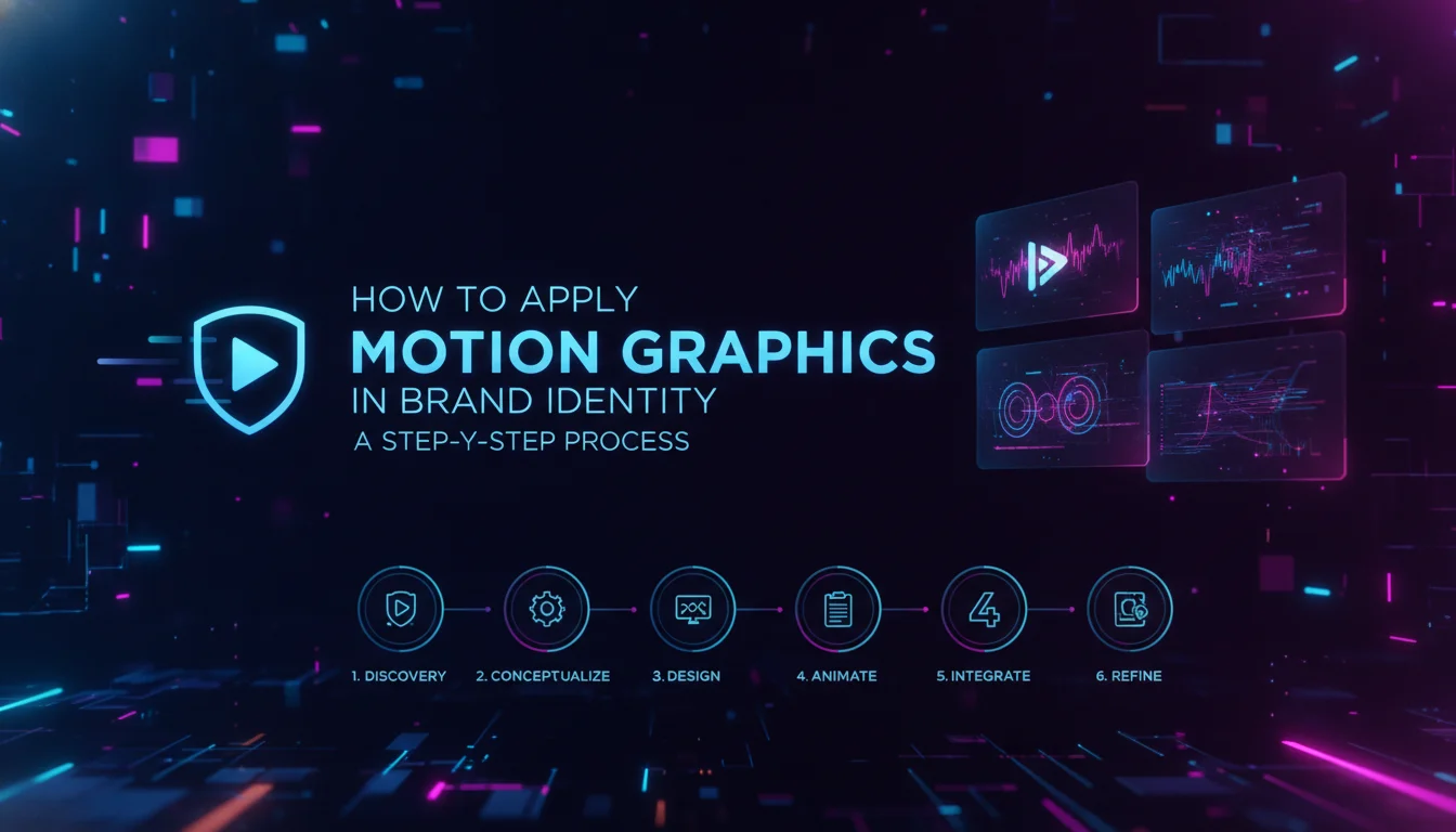
Applying motion graphics in brand identity effectively requires a structured process that runs parallel to, not after, the visual design phase. Here are the concrete steps we use at Emin Media.
Step 1: Define Brand Values and Motion Personality
Start by articulating what the brand feels like in motion. Write a brief that describes the brand’s energy: fast or slow, sharp or fluid, playful or precise. This motion personality brief becomes the filter for every animation decision that follows. Without it, motion choices are arbitrary.
Step 2: Bring Motion Designers into the Room Early
Collaboration between visual designers and motion specialists must start at the concept phase, not the delivery phase. As Connor Campbell observes, motion designers involved early will always produce more interesting outcomes because the two disciplines inform each other. Schedule joint concept sessions. Share rough sketches across both disciplines from week one.
Step 3: Develop a Motion Language
Define the core principles of how the brand moves. Document easing styles (does it ease in sharply or settle softly?), transition logic (does it wipe, fade, or morph?), timing relationships (are elements synchronized or staggered?), and directional rules (does the brand move left-to-right, bottom-up?). This motion language is as important as the type system.
Step 4: Create a Motion Style Guide
A motion style guide codifies everything from Step 3 into a shareable document. It should include animation specifications, approved easing curves, color usage in motion, typography behavior, and platform-specific guidance. Think of it as the brand book’s moving chapter. Without this guide, every new touchpoint becomes a guessing game.
Step 5: Build and Test Across Platforms
Animate the core brand elements and test them across every relevant surface: social media stories, website headers, digital ads, presentation decks, and app interfaces. Motion that works beautifully at full resolution on a desktop may feel clunky on a mobile screen. Optimize file formats and frame rates for each context. Collaborate with technical teams to ensure animations do not compromise load performance.
Step 6: Protect the Motion Identity Like Any Other Brand Asset
Just as brands protect their color values and typefaces, they must protect their animation style. Document approved motion assets, restrict unauthorized variations, and update the motion style guide as the brand evolves. Motion consistency builds recognition over time, the same way a consistent color palette does.
Comparison of Motion Graphics Tools
| Tool | Features | Best For | Learning Curve |
|---|---|---|---|
| Adobe After Effects | Advanced animation, compositing, and visual effects | Professional motion graphics and video production | High |
| Cinema 4D | 3D modeling, animation, and rendering | Complex 3D motion graphics | High |
| Blender | Open-source 3D creation suite with animation capabilities | Budget-friendly 3D animation projects | Medium-High |
| Figma | Design and prototype with basic animation features | UI/UX design with simple motion elements | Low-Medium |
| Cavalry | Data-driven animation and procedural motion | Scalable motion systems and generative animation | Medium |
| Keynote | Presentation software with animation options | Creating animated presentations and client pitches | Low |
Pros and Cons of Motion Graphics in Brand Identity
Motion graphics in brand identity offer significant advantages, but they also come with real trade-offs that every brand team should weigh before committing.
Pros
- Stronger brand recall: Human brains are naturally drawn to movement, making animated brand elements more likely to be remembered after a single exposure.
- Emotional depth: Motion communicates personality, energy, and tone in ways that static design cannot. A brand that moves well feels more alive and trustworthy.
- Platform versatility: A well-built motion identity adapts across social media, websites, digital ads, and broadcast without losing coherence.
- Competitive differentiation: Most brands still treat motion as an afterthought. Brands that build it in from the start stand apart in crowded digital feeds.
- Richer storytelling: Motion adds a time dimension to brand communication, allowing narratives to unfold in seconds rather than requiring the viewer to read.
- Multi-sensory engagement: When paired with sound design, motion identity engages both visual and auditory channels simultaneously, deepening the brand impression.
Cons
- Higher production cost: Building a proper motion identity requires specialized skills and more production time than static design alone.
- Technical complexity: Animations must be optimized for different platforms, file sizes, and frame rates. Poor optimization leads to slow load times and degraded user experience.
- Risk of overuse: Too much motion creates visual noise. Brands that animate everything end up communicating nothing. Restraint is a skill.
- Consistency is harder to maintain: Without a detailed motion style guide, different teams and vendors will produce motion assets that feel disconnected from each other.
- Requires early integration: Motion cannot be bolted on at the end of a branding project. Retrofitting motion onto a finished static identity almost always produces weaker results.
Common Mistakes to Watch Out For
Most motion branding failures share the same root causes. Knowing them in advance saves significant time and budget.
Treating Motion as an Afterthought
This is the most common and most costly mistake. Brands complete their static identity, then ask an animator to “make it move.” The result is animation that feels decorative rather than expressive. As Mitch Paone of DIA puts it directly: hiring animators to animate design does not work because the design is still being developed from a static mindset. Motion must be part of the brief from day one.
Animating Everything
More motion is not better motion. Brands that animate every element on every screen create visual fatigue. The goal is purposeful movement: motion that directs attention, communicates personality, or guides a user through an experience. If the animation does not serve one of those functions, cut it.
Ignoring Platform Constraints
A motion identity built only for a brand film will fail on Instagram Stories, in a web banner, or inside a mobile app. Each platform has different size constraints, autoplay rules, and audience behaviors. Build motion assets natively for each context, or at minimum, define how the motion language adapts across surfaces in the style guide.
Skipping the Motion Style Guide
Without documented motion principles, every new vendor or internal team member makes their own animation decisions. Over time, the brand’s motion identity fragments. A motion style guide is not optional. It is the difference between a brand that moves consistently and one that just has some animations.
Neglecting Sound Design
Sound is the dimension most motion branding projects drop entirely. Yet audio elements, from a sonic logo to UI micro-sounds, create a recall layer that purely visual animation cannot. If budget allows, invest in at least a basic sonic identity alongside the visual motion system.
A Realistic Scenario: Building a Motion Identity from Scratch
Here is how a motion branding project plays out in practice, based on the kind of work we do at Emin Media.
A mid-sized fintech startup approaches us with a completed static brand: a wordmark, a color palette of deep navy and electric green, and a type system. They want to launch a new app and need the brand to feel premium and trustworthy in motion. They have no motion assets and no motion guidelines.
We start with a motion personality workshop. The brand’s verbal identity uses words like “precise,” “confident,” and “clear.” We translate those into motion descriptors: slow easing curves, minimal bounce, deliberate directional movement from left to right (mirroring the reading direction and implying forward progress). Nothing spins. Nothing bounces. Everything settles with quiet authority.
Next, we run parallel design and motion explorations. While the visual team refines icon styles, the motion team is already testing how those icons enter the frame. One freeze-frame from a motion test reveals a compositional arrangement that becomes a key visual in the static identity. That discovery would never have happened if motion had been a Phase 2 project.
We deliver a motion style guide alongside the standard brand book. It covers easing specifications, approved transition types, logo animation variants for different contexts (full animation for brand films, a subtle pulse for app loading states, a static lockup for print), and platform-specific guidance for iOS, Android, and web.
The result: a brand that feels the same whether a user sees it in a 30-second brand film, a push notification animation, or a social media ad. That consistency is what motion graphics in brand identity are actually for.
The Impact of Motion Graphics on Brand Recognition
Motion graphics in brand identity create measurable advantages in how audiences perceive and remember a brand. The psychological and strategic effects are well-documented across the creative industry.
Psychological Appeal of Motion
Human brains are wired to notice movement. This is an evolutionary response, not a design trend. Animated brand elements exploit this hardwired attention mechanism, making them more likely to be noticed in a crowded feed and more likely to be retained after exposure. Brands that use motion strategically gain an attention advantage that static competitors simply cannot match.
Emotional Connection and Storytelling
Motion adds a time dimension to brand communication. A static logo communicates identity in a single frame. An animated logo communicates identity, personality, and energy across several seconds. That additional time is storytelling space. Brands like Mailchimp and Airbnb have used motion to make their identities feel warm, human, and approachable in ways that their static marks alone could not achieve.
Brand Recall Across Touchpoints
Consistency in motion, using the same easing curves, the same transition logic, the same timing relationships across every platform, trains audiences to recognize the brand even before they see the logo. The motion language becomes a brand signal in its own right. This is the same principle that makes a brand’s color palette recognizable out of context. Motion works the same way, just across time instead of space.
Challenges and Considerations in Motion Branding
Motion branding rewards brands that plan carefully and punishes those that improvise. Here are the structural challenges every team should anticipate.
Overuse of Motion
The risk of overusing animation is real. When everything moves, nothing stands out. Brands must define clear rules for when motion is used and when stillness is the stronger choice. Restraint in motion design is a creative decision, not a budget limitation.
Technical Limitations
Animations must be optimized for the platforms where they live. A high-fidelity After Effects render that works beautifully in a brand film may be completely impractical as a web animation. Technical teams need to be involved early to define format requirements, file size limits, and performance thresholds for each context.
Consistency Across Platforms
Maintaining consistency in motion graphics across different platforms is one of the hardest operational challenges in brand management. The motion style guide is the primary tool for solving this problem. Without it, every new touchpoint is a fresh negotiation about what the brand should look like in motion.
Motion Branding in 2026: Where Things Are Heading
As of 2026, motion graphics in brand identity have moved from a differentiator to a baseline expectation. Brands without a motion identity feel incomplete, the same way a brand without a defined typeface would have felt incomplete a decade ago.
Several trends are shaping the near-term direction of the field. AI-assisted animation tools are accelerating production, allowing smaller teams to generate motion assets at a scale that previously required large studios. This democratization is raising the floor of motion quality across the industry, which means the bar for standing out is rising in parallel.
Generative and data-driven motion, where brand animations respond to real-time inputs like user behavior, time of day, or content context, is moving from experimental to practical. Tools like Cavalry are making procedural motion systems accessible to brand designers without deep coding backgrounds.
Sound design is also getting more serious attention. As motion identity matures as a discipline, brands are recognizing that a visual motion system without a sonic counterpart is only half a system. Expect sonic branding to become a standard line item in brand identity projects over the next two to three years.
Studio Dumbar/DEPT’s practice of running bi-weekly internal sessions dedicated to motion experimentation, what they call “The Group,” points to a broader shift: motion literacy is becoming a core competency for brand designers, not a specialty outsourced to animators. The most competitive brand teams in 2026 are the ones where every designer can think in time as fluently as they think in space.
Frequently Asked Questions
What are motion graphics in brand identity?
Motion graphics in brand identity are animated visual elements, including moving logos, kinetic typography, dynamic color transitions, and sound design, used to make a brand feel alive and consistent across digital platforms. They extend a brand’s visual language into the dimension of time, communicating personality and values through movement rather than static form alone.
How do motion graphics enhance brand identity?
Motion graphics enhance brand identity by adding emotional depth, improving recall, and enabling richer storytelling across digital touchpoints. Because human brains are wired to notice movement, animated brand elements capture attention more effectively than static ones and leave a stronger impression after a single exposure.
Can you give examples of motion graphics in branding?
Strong examples include O2’s bubble motion system developed by Lambie-Nairn, Google’s fluid motion identity linking animation to UX, and Mailchimp’s and Airbnb’s use of animation to make their brands feel warm and human. Each of these uses motion not as decoration but as a core part of how the brand communicates.
Will motion graphics be replaced by AI?
AI is accelerating motion production workflows and making animation more accessible, but it is not replacing the strategic and creative thinking behind motion branding. Deciding how a brand should move, what its motion personality is, and how that motion serves business goals requires human judgment. AI handles execution speed; humans handle meaning.
What tools are best for creating motion graphics in brand identity?
Adobe After Effects remains the industry standard for professional motion graphics. Cinema 4D and Blender handle 3D animation at different budget levels. Cavalry is increasingly used for data-driven and generative motion systems. Figma covers basic motion needs within UI/UX design. The right tool depends on the complexity of the motion system and the team’s existing skill set.
How can brands ensure consistency in their motion identity?
Consistency starts with a motion style guide that documents animation principles, easing curves, transition types, timing relationships, and platform-specific guidelines. Beyond the document, it requires involving motion designers from the earliest stages of a brand project and treating motion assets with the same protection and governance applied to logos and color palettes.
Ready to build a brand that moves as powerfully as it looks? Contact Emin Media for a free brand consultation and let’s create a motion identity that makes your brand impossible to ignore.
Enjoyed this article?
Contact Emin Media for a free brand consultation and let's create something amazing together.
Get in TouchRelated Articles
Digital Marketing for Creatives: A Bold Guide
Digital marketing for creatives builds real visibility and sales. Learn strategies for social media, SEO,…
Branding & Design Agency Tips That Actually Work
Discover branding and design agency tips to choose the right partner, set clear goals, and…
Creative Agency Pitch Deck Tips That Win Clients
Master creative agency pitch deck tips that win clients in 2026. Learn storytelling, design, and…