Minimalist Logo Design Trends: What Works in 2026
Minimalist logo design trends are the practice of reducing a brand mark to its most essential visual elements: clean geometry, limited color, and purposeful negative space. Done right, this approach creates logos that scale from favicon to billboard without losing impact. Done wrong, it turns memorable brands into forgettable ones.
Key Takeaways
- design trends favor geometric shapes, monochromatic palettes, and negative space as primary brand tools.
- Research from Distinctive BAT shows that oversimplification can destroy brand recognition, while strategic simplification can improve attribution.
- Brands like Toyota, Burger King, and Post-it succeeded by simplifying while preserving their most distinctive visual assets.
- Intel, Peugeot, and Warner Bros. lost recognition by removing the very elements that made their logos unique.
- As of 2026, design is moving toward responsive logo systems and post-minimalist warmth, not away from simplicity entirely.
- Every minimalist logo must be tested for misattribution before launch. Simplicity without distinctiveness is just invisibility.
What Defines Minimalist Logo Design?
Core Principles of Minimalism in Logos
Minimalist logo design is the deliberate use of the fewest possible visual elements to communicate a brand’s identity with maximum clarity. Every line, curve, and blank area serves a purpose. This is not about creating a plain or unfinished mark. It is a disciplined method of visual communication built on balance, restraint, and instant legibility. The philosophy is simple: strip away everything that doesn’t earn its place.
Common Elements of Minimalist Logos
Minimalist logos share a recognizable visual vocabulary. Geometric shapes like circles, squares, and triangles carry universal meaning with quiet elegance. Color palettes stay monochromatic or extremely limited, relying on a single hue or black and white to sharpen memorability. Typography skews sans-serif, ultra-fine, or custom-lettered with clean lines. Negative space does double duty, embedding secondary symbols without adding visual weight. These elements combine to produce a mark that is visually quiet but conceptually loud.
Minimalism Versus Simplistic Design
There is a real difference between a minimalist logo and a simplistic one. Minimalism is strategic reduction that amplifies meaning. Simplistic design is what happens when thoughtful composition is skipped entirely. A well-crafted minimalist logo endures because it distills a brand’s essence into something irreplaceable. A simplistic one looks generic within a year. As more brands chase this type of trends, the risk of crossing into forgettable territory grows, making rigorous design thinking more critical than ever.
Pros and Cons of Minimalist Logo Design
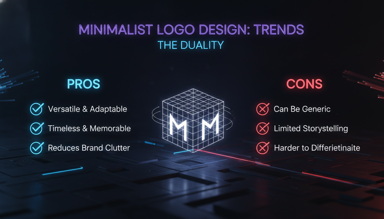
Pros
- Cross-media versatility: A minimal mark scales from a 16px app icon to a full-building mural without losing legibility.
- Faster recognition: Stripped-down forms are processed more quickly by the brain, creating stronger memory shortcuts.
- Lower production costs: Fewer colors and simpler geometry reduce print, embroidery, and digital production expenses.
- Modern cultural alignment: Clean logos signal confidence, transparency, and forward-thinking brand values to digitally native audiences.
- Timeless foundation: Minimalist logos built on strong geometry tend to age better than trend-heavy ornamental marks.
Cons
- Risk of misattribution: Remove too many distinctive elements and consumers start confusing your brand with competitors.
- Lost brand equity: Heritage brands that strip iconic assets can sever emotional connections built over decades.
- Legibility failures at small sizes: Ultra-thin typography and abstract shapes can become unreadable at favicon scale.
- Sea of sameness: When every brand goes minimal, minimal stops being distinctive.
- Trend vulnerability: Extreme minimalism can date quickly as design cycles shift toward warmth and texture.
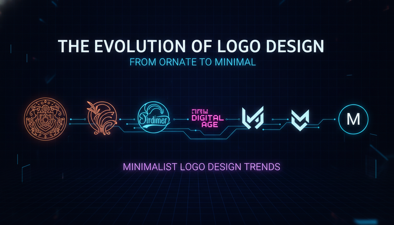
The Evolution of Logo Design: From Ornate to Minimal
A Brief History of Logo Minimalism
Logo design has swung between ornamentation and simplicity for centuries. In the 19th century, elaborate script logotypes and ornate emblems were the standard. The modernist movement of the mid-20th century began shifting toward cleaner, more abstract marks. Designers like Paul Rand demonstrated with his work for IBM, ABC, and UPS that a simple symbol could carry enormous corporate weight. That legacy paved the way for the minimalist wave of the 2010s, when brands like Google, Microsoft, and Airbnb flattened their logos, shedding gradients, shadows, and complex illustrations in favor of clean, scalable marks.
The Digital Catalyst: Why Screens Demanded Simplicity
The digital revolution accelerated this kind of design trends faster than any single aesthetic movement could. Brands suddenly needed to appear across an endless range of screen sizes, from tiny favicons to giant billboards, and intricate details became liabilities overnight. Scalable vector graphics and responsive design required marks that read effortlessly at 16×16 pixels. Flat design’s rise in user interfaces pushed companies to adopt simpler visual identities that felt native to digital environments. The result was a wave of rebranding toward minimalism that prioritized versatility over ornamentation.
The Debranding Phenomenon
“Debranding” is the deliberate removal of unique identifying features from a logo in favor of a more universal, simple look. As documented by Creative Bloq in 2023, brands like Intel, Peugeot, and Warner Bros. stripped away iconic elements in the name of mobile-first optimization. The problem is that debranding can erase the historical equity built into a mark over generations. Understanding when simplification helps versus harms is central to navigating the logo design trends with real strategic intent rather than just following the crowd.
Key Minimalist Logo Design Trends in 2026
Geometric Simplicity: Shapes That Speak
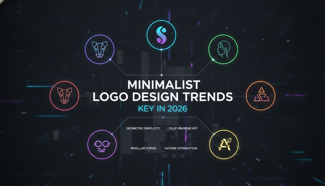
Geometric forms continue to anchor trends as of 2026. Circles suggest unity and community. Triangles imply direction or stability. Squares denote balance and professionalism. Designers are using these basic shapes not just as containers but as the primary narrative device. A single circle with a subtle cut can represent a planet, a lens, or a compass, making it astonishingly versatile. The trend favors hard edges and precise proportions over organic curves, aligning with a tech-driven aesthetic that feels both timeless and current.
Negative Space: Hidden Messages in Plain Sight
Negative space has evolved from clever trick to essential brand strategy within minimalist logo. Modern logos use the white space around and inside primary elements to suggest a secondary image or idea. FedEx’s arrow, hidden between the E and x, is the classic reference point. Today’s iterations embed narratives about sustainability, innovation, or heritage without adding a single extra element. This technique maximizes impact while preserving simplicity, and it remains one of the most powerful tools in a minimalist designer’s kit.
Monochromatic Mastery: The Power of One Color
Monochromatic palettes have always been a staple of minimalist logo design trends, but 2026 sees a bolder approach to the single-hue strategy. A deep indigo, a vivid coral, or a rich terracotta can make a logo unforgettable without adding visual clutter. Color psychology research consistently shows that one strong, well-chosen color can evoke specific emotions more directly than a multi-hued palette. Monochromatic palettes also simplify application, ensuring the logo reads consistently across digital and print media without requiring complex color management.
Ultra-Fine Typography: Letting Letters Breathe
Typography within minimalist logo design trends has shifted toward ultra-light, fine-line sans-serif fonts. These airy letterforms convey sophistication and modernity. Combined with generous letter spacing, they create a sense of luxury and clarity that heavier type simply cannot achieve. The risk is illegibility at small sizes, which means designers must balance thin strokes with sufficient x-height. Customized lettering with subtle tweaks, a unique ligature or a gently curved terminal, helps a logotype stay distinctive while remaining firmly minimalist.
Responsive and Variable Logo Systems
The most forward-thinking evolution in minimalist logo design trends is the responsive logo system. Rather than one static mark, brands create a flexible suite: a primary logo, a compact icon, a wordmark, and contextual variations that adapt to placement and scale. Google’s dynamic doodles and MIT Media Lab’s algorithmically generated marks point toward this direction. Minimalist logic underpins every variation, each one stripped to essentials, but the outcome is a living brand identity that feels personal and adaptable. This may be the true heir to minimalism: simplicity that reconfigures without losing identity.
Post-Minimalism and the Return of Warmth
Design, like fashion, moves in cycles. Just as minimalism reacted against skeuomorphism, a swing toward more expressive, tactile logos is already visible in 2026. Post-minimalism retains the structural clarity of minimalism but reintroduces subtle textures, gradients, and nostalgic elements. According to VistaPrint’s 2026 Logo Design Trends report, styles like “Storybook Gothic” are gaining traction, channeling folklore and fantasy with ornate typography and rich color palettes including deep greens, midnight blues, and burgundy. Even these neo-detailed logos borrow minimalist principles: a strong core shape, a limited palette, and a clear focal point. Minimalism has permanently shaped logo design, even where it appears to recede.
Why Brands Are Embracing Minimalist Logo Design Trends
Improved Versatility Across Media
A minimalist logo’s simplicity is its greatest strength in a multi-platform world. It works on a smartphone app icon, a social media profile picture, a website header, and physical merchandise without requiring separate versions for each context. As Adobe’s design guide states, “the less detailed your design, the more quickly your audience will recognize it.” This cross-media consistency reduces production costs and maintains brand integrity wherever the logo appears, from a business card to a trade show banner.
Faster Brand Recognition and Recall
Cognitive fluency theory suggests that people prefer things that are easy to process. Minimalist logos, with their stripped-down forms, are processed more quickly by the brain. Research from Distinctive BAT confirms that certain simplified logos actually improved brand attribution when the simplification was done strategically. When executed well, a minimalist logo becomes a powerful shortcut to brand memory, requiring less mental effort to identify and recall than a complex mark.
Aligning with Modern Consumer Aesthetics
Contemporary consumers associate minimalism with authenticity, transparency, and confidence. In a cluttered advertising environment, a clean logo signals that a brand knows exactly who it is. Brands like Apple, Nike, and Muji have set this standard, and countless startups follow suit to project a sleek, forward-thinking image. This cultural alignment makes minimalist logo design trends a strategic choice, not just an aesthetic one, for brands aiming to connect with digitally native audiences.
The Research: Do Minimalist Logos Actually Work?
The Distinctive BAT Study: Methodology and Findings
Brand asset research company Distinctive BAT conducted a study surveying 750 UK consumers to test recognition and attribution of old versus new logos with brand names removed. They measured three metrics: asset recognition (how many recognized the logo), brand attribution (how many correctly identified the brand), and misattribution (how many assigned it to a competitor). The results painted a mixed picture. Some minimalist redesigns devastated brand equity. Others strengthened it. The difference came down to one question: did the redesign preserve or discard the brand’s most distinctive visual assets?
When Simplification Hurts: Intel, Peugeot, Warner Bros.
The Distinctive BAT study highlighted notable failures among brands that removed major elements of their identity. Intel’s removal of its circular swoosh, Peugeot’s reduction of its full lion to just a head, and Warner Bros.’ flattening of its classic monogram all led to measurable drops in recognition and correct attribution. According to Distinctive BAT’s head of strategy Cathal Gillen, these redesigns “threw the baby out with the bathwater,” discarding the very elements that made the marks distinctive. Legibility played a role too. Kia’s overly stylized minimalist logo confused consumers, with some misreading it entirely.
When Simplification Helps: Toyota, Burger King, Post-it
Conversely, minimalist updates helped Toyota, Burger King, and Post-it achieve better brand attribution. The key difference, according to Distinctive BAT, is that these brands “enhanced the elements that made their logos distinctive in the first place.” Toyota refined its iconic overlapping ellipses without losing the core symbol. Burger King pared back while preserving the bun shape and vivid colors. Post-it retained its unmistakable square format and recognizable font style. These successes prove that minimalist logo design trends can build equity when they honor existing brand codes rather than erasing them.
“While some of the new logos on the market are aesthetically more appealing, many of them throw the baby out with the bathwater.” – Cathal Gillen, Head of Strategy, Distinctive BAT
“A business logo is more than a mark; it embodies the company’s visual identity. Get to know the client and their field extensively before you start to sketch.” – Sarah Giffrow, Creative Director, Adobe
| Aspect | Pros of Minimalism | Cons of Minimalism |
|---|---|---|
| Brand Recognition | Simple shapes are easier to remember quickly | Oversimplification can erase uniquely identifying cues |
| Cross-Media Versatility | Scales from favicon to billboard without redesign | Flat, one-color designs may lack presence in print |
| Modern Appeal | Projects a forward-thinking, clean image | May look dated as design cycles shift toward warmth |
| Attribution | Refreshes outdated marks while keeping equity | If key assets are removed, misattribution rises |
| Design Timelessness | Less reliant on short-lived fads | Can become indistinct in a sea of similar minimal icons |
Minimalist Logo Design Across Industries
Tech: Where Minimalism Feels Native
Technology brands were early adopters of minimalist logo design trends, and the fit makes sense. Clean, geometric marks mirror the precision and efficiency that tech products promise. Apple’s bitten apple, Google’s four-color G, and Spotify’s soundwave circle all demonstrate how a stripped-back mark can carry enormous brand weight. For tech startups in 2026, a minimalist logo is almost a category signal, communicating that the brand belongs in a digital-first world.
Fashion: Minimalism as Luxury Signal
Luxury fashion brands have used minimalist logo design trends to signal exclusivity for decades. Celine, Bottega Veneta, and Saint Laurent all stripped their logos to clean wordmarks with refined typography. The message is clear: we don’t need decoration to prove our worth. However, this approach works because these brands have deep heritage equity. A new fashion label attempting the same move without that foundation risks looking generic rather than refined.
Food and Beverage: Where Warmth Still Wins
Food and beverage brands face a different challenge with minimalist logo design trends. Warmth, appetite appeal, and personality are essential in this category, and extreme minimalism can strip those qualities away. Burger King’s 2021 redesign succeeded because it retained the warm color palette and rounded bun shape that felt approachable and familiar. The lesson for food brands: minimalism works best when it simplifies without going cold.
A Step-by-Step Guide to Creating an Effective Minimalist Logo
Step 1: Research and Brand Immersion
Before sketching a single line, immerse yourself in the brand’s mission, values, audience, and competitive landscape. As Adobe’s minimalist logo design guide advises, “A business logo is more than a mark; it embodies the company’s visual identity.” Conduct stakeholder interviews, audit existing brand assets, and collect visual examples that resonate with the client. A moodboard aligns visions early and serves as a shared reference throughout the entire process.
Step 2: Sketching and Concept Development
Start with pencil and paper. Generate dozens of rough ideas before touching a screen. Focus on core shapes that symbolize the brand’s essence without worrying about polish yet. Explore negative space opportunities, letterform integrations, and proportional variations. Adobe creative director Sarah Giffrow emphasizes iterative sketching and the value of moodboards as “a shared reference point throughout the process.” Narrow your concepts to 3 to 5 strong directions that adhere to minimalist principles of balance, simplicity, and layered meaning.
Step 3: Digital Refinement and Feedback
Bring selected concepts into vector software. Refine curves, test monochromatic and single-color versions, and preview at multiple scales. Ensure legibility at tiny sizes and maximum sizes alike. Share with a small test group to gauge misattribution risks. Does anyone confuse the mark with a competitor? Based on Distinctive BAT’s findings, prioritize preserving “embedding vehicles” like distinctive shapes, color systems, or typographic signatures that anchor consumer memory. Iterate until the design is both minimalist and unmistakably yours.
Balancing Minimalism with Brand Distinctiveness
Preserve Key Brand Assets
Distinctive BAT’s research makes a clear case against discarding established visual codes. Assets like Adidas’s three stripes, McDonald’s golden arches, or the Toblerone mountain anchor consumer memory in ways that no amount of advertising spend can quickly replace. The biggest cost of extreme simplification, as Cathal Gillen notes, is the “lost opportunity to embed additional branding assets.” Even a minimalist evolution should keep at least one iconic element to bridge past and present, giving loyal customers something familiar to hold onto.
Ensure Legibility Across Sizes
Legibility is non-negotiable in minimalist logo design trends. The Kia example demonstrates that an overly abstract or ultra-thin logo can fail at small sizes, creating confusion rather than recognition. Test your logo in web headers, app icons, and printed materials no larger than a postage stamp. If any detail blurs or letters merge, increase weight or simplify further. Every pixel must pull its weight. A logo that cannot be read is not minimal. It is invisible.
Test for Misattribution
Before launch, validate your design with unbiased audiences. Remove all brand context and ask people to identify the brand and its industry. If a significant portion guesses incorrectly or cannot recall the mark, adjust for distinctiveness. The Distinctive BAT approach, measuring recognition, attribution, and misattribution as separate metrics, provides a practical framework any brand can adapt. A successful minimalist logo must be both simple enough to process instantly and singular enough to stand apart in a competitive set.
Frequently Asked Questions
What is a minimalist logo?
A minimalist logo is a brand symbol that uses the fewest possible visual elements, including simple geometric shapes, limited colors, and clean typography, to convey a company’s identity. It prioritizes clarity, instant recognition, and versatility across all media and sizes.
Why are minimalist logos so popular?
Minimalist logos gained popularity largely because of the digital shift, where brand marks must work across countless screen sizes and resolutions. They also align with modern consumer preferences for clean, transparent, and uncluttered branding that signals confidence rather than noise.
Are minimalist logos less recognizable?
Not inherently. Research from Distinctive BAT, which surveyed 750 UK consumers, shows that some minimalist redesigns lowered recognition while others improved attribution. The outcome depends entirely on whether the simplification preserves or discards the brand’s most distinctive visual assets.
How do I make my minimalist logo unique?
Focus on negative space to embed hidden meaning, customize typography with subtle but ownable details, and select one unexpected bold color that your brand can own consistently. Most importantly, anchor the design in at least one irreplaceable visual element that only your brand uses.
What are the key minimalist logo design trends for 2026?
Leading minimalist logo design trends for 2026 include geometric simplicity, sophisticated negative space, monochromatic palettes, ultra-fine typography, and responsive logo systems that adapt across contexts. The overarching theme is creating marks that are both timeless and flexible enough for emerging technologies and platforms.
Do minimalist logos work for all brands?
Minimalist logo design trends work best for brands seeking a modern, tech-forward, or luxury image. Heritage brands or those built on ornamental identity should approach simplification carefully. Stripping too much can sever emotional connections with loyal customers and erase equity that took decades to build.
Ready to build a brand mark that’s simple, strategic, and impossible to ignore? Contact Emin Media for a free brand consultation and let’s create something bold together.
Enjoyed this article?
Contact Emin Media for a free brand consultation and let's create something amazing together.
Get in TouchRelated Articles
Digital Marketing for Creatives: A Bold Guide
Digital marketing for creatives builds real visibility and sales. Learn strategies for social media, SEO,…
Branding & Design Agency Tips That Actually Work
Discover branding and design agency tips to choose the right partner, set clear goals, and…
Creative Agency Pitch Deck Tips That Win Clients
Master creative agency pitch deck tips that win clients in 2026. Learn storytelling, design, and…