How to Create a Brand Style Guide in 2026
Key Takeaways
- A brand style guide is the single source of truth for how your brand looks, sounds, and communicates across every channel.
- Start with brand identity fundamentals: mission, values, and audience personas before touching any design software.
- Include logo rules, color palette with hex codes, typography specs, voice guidelines, and imagery direction.
- Host your guide online so updates reach everyone instantly, no chasing old PDF versions.
- Review and refresh the guide at least once a year, or after any major brand shift.
- Avoid the three most common mistakes: overcomplicating the document, skipping team input, and never updating it.
How to Create a Brand Style Guide in 2026
How to create a brand style guide is the process of building a single reference document that defines your brand’s visual identity, voice, and messaging rules so every piece of content, from a social post to a billboard, looks and sounds unmistakably yours.
What Is a Brand Style Guide?
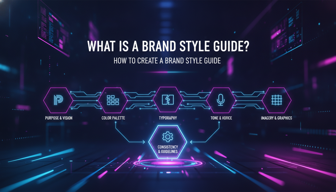
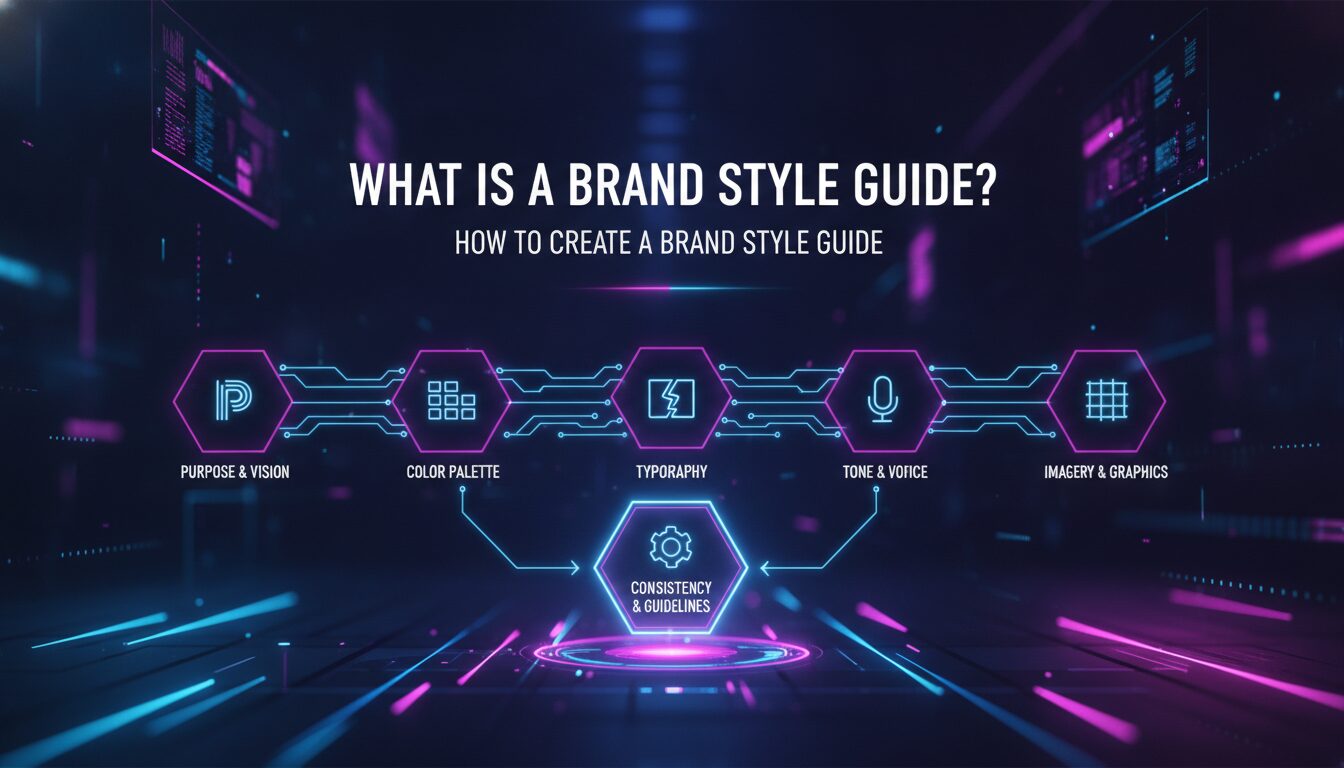
A brand style guide is a rulebook for everything your team creates. It covers what fonts to use, how logo treatments work with different color schemes, what tone your copy should carry, and how imagery should feel. Whether you’re crafting a tweet, designing a business card, or producing a full ad campaign, the guide ensures your work stays consistent with your brand identity, both visually and in voice.
According to Adobe’s creative resources, a thorough brand book makes it easy for anyone in an organization to effectively represent the brand. Designers, copywriters, developers, and external partners can all work from the same building blocks without second-guessing each other.
As of 2026, brand style guides have evolved beyond static PDFs. Leading teams now host living documents on platforms like Figma or Canva, where updates propagate instantly across the organization. That shift matters because brand drift, the slow creep of inconsistency, is one of the most common and costly problems creative teams face.
Why Brand Consistency Is Non-Negotiable
People personify brands. Just as we trust friends with stable, consistent personalities, we trust brands that always look and feel the same. According to The Brand Strategy Lab, consumers engage with brands across multiple touchpoints, including social media, websites, emails, and print, and on average it takes 6 to 8 interactions before they consider making a purchase. Every inconsistent touchpoint chips away at that trust-building process.
Canva’s brand research notes that consumers see roughly 6,000 to 10,000 ads every day, and only a fraction stick. A cohesive brand style is what makes yours one of the ones that does.
“A brand style guide is an essential tool to ensure your company produces consistent, cohesive work, especially if you work with creative partners like freelancers or a marketing agency.” – Adobe Creative Cloud Resources
Components of a Brand Style Guide
- Visual Identity: Logo, color palette, typography, and imagery direction.
- Voice and Tone: How your brand communicates, and how that shifts by context.
- Usage Guidelines: Specific rules for applying visual elements correctly across formats.
- Audience Personas: Who you’re talking to, so every creative decision stays audience-first.
How a Brand Style Guide Actually Works
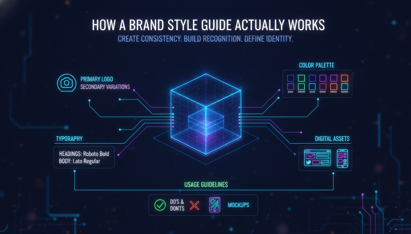
A brand style guide works by translating abstract brand values into concrete, repeatable creative decisions that anyone on your team can execute without needing to ask a creative director every time.
Think of it as a creative operating system. Your brand identity, the mission, values, and personality, sits at the core. The style guide is the interface layer that converts that identity into specific instructions: use Pantone 286 for primary blue, set headlines in Neue Haas Grotesk at 32pt, write in second person with a confident but approachable tone.
When the guide is well-built, three things happen automatically:
- Speed increases. Designers stop making judgment calls from scratch. Writers stop guessing whether the brand would say “get started” or “begin your journey.” Decisions are already made.
- Quality stabilizes. The floor rises. Even junior team members and external vendors produce work that feels on-brand because the rules are clear.
- Trust compounds. Every consistent touchpoint reinforces recognition. Recognition builds familiarity. Familiarity builds trust. Trust drives purchase decisions.
The guide also functions as an onboarding tool. A new hire or a new agency partner can read it and understand your brand’s creative DNA in an afternoon, rather than absorbing it through months of feedback loops.
“Style guides contain everything that marketers and designers need for brand management, specifically related to creating branded assets, from color palette, to brand voice and tone, to logos and imagery.” – Canva Brand Resources
Step-by-Step: How to Create a Brand Style Guide
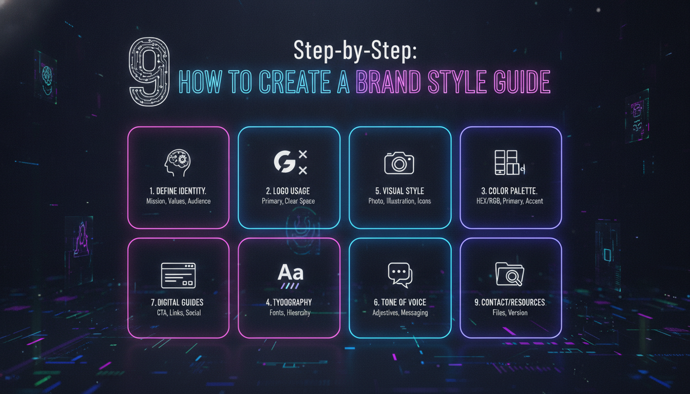
Creating a brand style guide follows a clear sequence: define your brand identity first, build the visual system second, document voice and tone third, then package and share the whole thing in a format your team will actually use.
Step 1: Define Your Brand Identity
Before you open any design software, articulate the foundation. This is the work most teams skip, and it’s why their style guides feel hollow. Your brand identity includes:
- Mission Statement: What is your brand’s purpose beyond making money? What problem do you exist to solve?
- Core Values: What principles guide every decision, from product development to customer service?
- Target Audience: Build real personas. Adobe recommends giving them nicknames, like “Vanlife Vanessa” or “Homebody Horace,” so designers and writers can picture a real human when making creative decisions.
- Brand Personality: If your brand were a person, how would it speak? Formal or casual? Warm or authoritative? Playful or serious?
- Name and Tagline: Document what makes the name memorable and what the tagline expresses about your value, in the brand’s own voice.
Step 2: Build Your Visual Identity System
Once the identity foundation is solid, translate it into visual rules. This is the section most people think of when they hear “brand style guide,” but it only works when it’s grounded in Step 1.
Logo: Specify a full logo for use where space allows, plus a secondary version for tight spaces. Define proportions, alignment, minimum sizes, clear space requirements, and approved color variations. Include a “do’s and don’ts” section showing misuse examples. Adobe Illustrator is the industry standard for creating and exporting logo files in vector format.
Color Palette: Establish primary and secondary colors. For every color, specify the hex code for digital use, RGB values for screen, and CMYK values for print. This precision matters: a slightly wrong blue on a printed brochure versus a website creates subtle inconsistency that erodes brand trust over time.
Typography: Define two to three typefaces maximum. Specify which font is for headlines, which is for body copy, and which (if any) is for accent use. Include size, weight, line spacing, and letter spacing guidelines. Add web font specifications so developers can match print and digital treatments.
Photography and Imagery: Define the photographic style. Is it candid or posed? Bright and airy or moody and cinematic? Reference your buyer personas here. The types of images that resonate with “Vanlife Vanessa” look very different from those that connect with a C-suite executive.
Iconography: From social media icons to app buttons, define the visual style. Icons should be easy to understand and consistent with the overall visual language.
Step 3: Document Voice and Tone
Voice is your brand’s consistent personality in writing. Tone is how that personality adjusts based on context. Both need to be documented with examples, not just descriptions.
- Voice: Is it formal, casual, humorous, or direct? Does it use contractions? Does it use slang? Does it refer to the company as “we” or in the third person?
- Tone Variations: A brand might be warm and encouraging in a welcome email, but clear and precise in a legal notice. Document both.
- Examples: Show the difference between on-brand and off-brand copy side by side. This is the most useful thing you can add to the voice section.
Step 4: Package and Share the Guide
A style guide no one can find is a style guide that doesn’t work. Host it online, whether in Figma, Canva, Notion, or a dedicated brand portal. Make sure every team member, freelancer, and agency partner knows where it lives and how to access it. Figma’s resource library recommends sharing the guide broadly and building a process for keeping it current.
How to Apply Your Brand Style Guide in Practice

Applying a brand style guide means embedding it into your team’s actual workflow, not just filing it somewhere and hoping people read it.
Here’s how we approach this with clients at Emin Media:
- Integrate it into project kickoffs. Every new campaign, content series, or design project starts with a review of the relevant style guide sections. This takes five minutes and prevents hours of revision later.
- Build templates from it. Create pre-built social media templates, email headers, presentation decks, and document covers that already follow the guide. When the template is on-brand, the output is on-brand by default.
- Use it in creative briefs. Reference specific style guide sections in every brief you send to designers or writers. “Use the secondary color palette” is vague. “Use the secondary palette as defined on page 4 of the brand guide” is actionable.
- Make it part of your review checklist. Before any piece of content goes live, run a quick brand consistency check: correct logo version, correct colors, correct fonts, correct tone.
- Train new team members with it. The style guide should be part of every creative onboarding. Walk new hires through it, answer questions, and make sure they know it’s a living document they can contribute to.
Brand Spotlight: What Great Style Guides Look Like
Real-world examples show how the best brands use their style guides to build instant recognition and creative consistency.
- Mailchimp: Known for its playful tone and vibrant yellow, Mailchimp’s style guide balances fun with professionalism. Their voice section is particularly strong, with detailed examples showing how to write with personality without losing clarity.
- Spotify: Their guide emphasizes a modern aesthetic with clear rules on typography and imagery. The visual system is bold and flexible enough to work across everything from app UI to festival posters.
- Apple: Apple’s approach is a study in restraint. Their style guide enforces minimalism and clarity at every level, from product photography to retail signage. Every element earns its place.
What these brands share: their style guides aren’t just design documents. They’re expressions of a point of view. The rules exist to protect and amplify a creative vision, not to limit it.
Comparison of Brand Style Guide Tools
| Tool | Features | Best For | Price Range |
|---|---|---|---|
| Canva | Easy-to-use templates, brand kit, collaboration features, online hosting | Small businesses and startups | Free to mid-tier paid plans |
| Adobe Illustrator | Advanced design capabilities, vector graphics, precise layout control | Professional designers building from scratch | Subscription-based |
| Figma | Collaborative design, real-time editing, design system integration, shareable links | Design teams working across multiple projects | Free tier available, paid for teams |
| Notion | Flexible document structure, easy linking, non-designer friendly | Teams who want a text-first, accessible guide | Free to mid-tier paid plans |
| Adobe InDesign + Express | Professional layout, export to PDF, Express for quick branded assets | Agencies and larger brand teams | Subscription-based |
Pros and Cons of Creating a Brand Style Guide
Pros
- Consistency at scale. Every team member and external partner works from the same rules, so your brand looks and sounds the same whether it’s a social post or a trade show banner.
- Faster production. Pre-made decisions mean fewer revision cycles and faster turnaround on creative work.
- Stronger brand recognition. Repeated, consistent visual and verbal cues build the kind of familiarity that drives trust and purchase intent.
- Easier onboarding. New hires and new agency partners get up to speed faster when there’s a clear creative reference document.
- Better creative briefs. When the guide exists, briefs become more specific and actionable, which means better work from your creative team.
Cons
- Upfront time investment. Building a thorough guide takes real effort, especially the brand identity foundation work in Step 1.
- Risk of rigidity. A poorly written guide can feel like a creative straitjacket if it’s too prescriptive and doesn’t allow for contextual flexibility.
- Maintenance overhead. Brands evolve. A guide that isn’t updated becomes a liability, pointing people toward outdated rules.
- Adoption challenges. If the guide isn’t actively promoted and embedded in workflows, it gets ignored. A style guide no one uses is just a document.
Common Mistakes to Avoid
Most style guide failures come down to the same handful of avoidable errors. Here’s what to watch for when you learn how to create a brand style guide for the first time.
1. Overcomplicating the Guide
A 200-page brand bible sounds impressive. In practice, it’s a document no one reads. Keep the guide focused and easy to navigate. Use clear sections, visual examples, and plain language. If a rule requires three paragraphs to explain, it’s probably too complex to enforce consistently.
2. Neglecting Updates
Brands evolve. Your visual identity shifts. Your tone matures. Your audience changes. A style guide that was accurate two years ago may be actively misleading today. Schedule a formal review at least once a year, and trigger an unscheduled review any time you make a significant brand decision, like a logo refresh or a new product line launch.
3. Ignoring Team Input
The people who use the guide every day, designers, writers, social media managers, know what’s missing from it. Involve them in the creation process. Run a review session before publishing. The guide will be more accurate, more useful, and more likely to be adopted if the people it serves had a hand in building it.
4. Skipping the Voice and Tone Section
Most first-time style guides nail the visual elements and completely skip voice and tone. This is a critical gap. Visual consistency without verbal consistency creates a brand that looks right but sounds wrong. Your copy is as much a part of your brand identity as your logo.
5. Building It and Forgetting It
Publishing the guide is not the finish line. It’s the starting line. The guide needs to be actively promoted, referenced in briefs, included in onboarding, and linked in project management tools. Treat it like a product, not a one-time deliverable.
A Worked Example: Building a Style Guide for a Coffee Brand
Here’s how the process plays out in a real creative scenario. Imagine a specialty coffee brand called Groundwork Roasters launching in 2026. They’re targeting urban professionals who care about craft, sustainability, and ritual.
Step 1: Identity. Their mission is to make exceptional coffee accessible without pretension. Core values: craft, transparency, community. Persona: “Morning Ritual Marcus,” a 32-year-old urban professional who reads ingredient labels and follows independent roasters on Instagram.
Step 2: Visual System. Primary color: a deep espresso brown (hex #3B1F0E). Secondary: a warm cream (hex #F5ECD7). Accent: a muted sage green (hex #7A9E7E) to signal sustainability. Logo: a simple wordmark in a geometric sans-serif, with a secondary icon mark (a stylized coffee bean) for small-format use. Photography style: natural light, close-up textures, hands holding cups. No stock photo energy.
Step 3: Voice. Confident but never condescending. Knowledgeable but never jargon-heavy. They say “this coffee tastes like a Saturday morning” not “notes of caramel with a bright, acidic finish.” They use contractions. They write in second person. They never use exclamation points.
Step 4: Packaging and Sharing. The guide lives in Figma, shared with the internal team, their packaging designer, and their social media agency. Every new project brief links directly to the relevant section.
The result: six months after launch, every touchpoint, from the bag design to the Instagram grid to the email newsletter, feels like it came from the same creative mind. That’s what a well-executed style guide does.
Best Practices for Creating a Brand Style Guide
The best brand style guides share a few qualities that separate them from documents that gather digital dust.
Keep It Accessible
Host your style guide online, making it easy for every team member to access and reference without hunting through email threads for the latest version. When the guide lives in a shared platform, updates happen once and propagate everywhere.
Use Templates
Build pre-designed templates for your most common content formats: social media posts, email headers, presentation decks, and document covers. Templates that already follow the style guide make on-brand output the path of least resistance.
Regularly Update the Guide
As your brand evolves, your style guide must keep pace. Schedule formal reviews and treat the guide as a living document. A style guide that reflects last year’s brand is worse than no guide at all, because it actively misleads your team.
Include Real Examples
For every rule you write, show it in action. Show the correct logo placement next to an incorrect one. Show on-brand copy next to off-brand copy. Visual and written examples make abstract rules concrete and enforceable.
The 2026 Outlook: Where Brand Style Guides Are Heading
This year, the most forward-thinking brand teams are treating their style guides as design systems, not just documents. The shift is significant. A design system connects your brand rules directly to production tools: components in Figma, tokens in code, templates in Canva. When a designer updates a color in the system, it updates everywhere automatically.
AI-assisted content creation is also reshaping how style guides get used. Teams are now feeding their voice and tone guidelines directly into AI writing tools to generate on-brand first drafts. This makes the voice section of your style guide more valuable than ever. A vague voice description produces generic AI output. A precise, example-rich voice guide produces content that actually sounds like your brand.
For brand owners and marketing managers building or refreshing their guides in 2026, the priority is clarity and connectivity: clear enough that anyone can follow it, connected enough that it lives inside the tools your team already uses every day.
If you want to explore how to create a brand style guide that works as a design system, our team at Emin Media has built brand identity frameworks for startups, scale-ups, and established brands across multiple industries. We’d love to help you build something that lasts.
Frequently Asked Questions
What is the purpose of a brand style guide?
A brand style guide ensures consistency in visual and verbal communication across every platform and format. It gives designers, writers, and external partners a shared set of rules so your brand looks and sounds the same whether it appears on a social post, a product package, or a billboard.
How often should a brand style guide be updated?
Review your style guide at least once a year, and trigger an unscheduled review any time you make a significant brand decision, like a logo refresh, a new product line, or a shift in target audience. A guide that reflects an outdated brand actively misleads your team.
Can I create a brand style guide without a designer?
Yes. Tools like Canva offer brand kit features and pre-built templates that make it possible to document your visual identity without professional design skills. That said, investing in a designer for the logo and color system work will pay off in long-term consistency and quality.
What elements should be included in a brand style guide?
Essential elements include logo usage rules, color palette with hex and CMYK codes, typography specifications, voice and tone guidelines with examples, imagery direction, and audience personas. More advanced guides also include iconography rules, motion design principles, and social media-specific templates.
What is the 3-7-27 rule of branding?
The 3-7-27 rule suggests that it takes roughly 3 interactions for someone to recognize your brand, 7 interactions to remember it, and 27 interactions to develop genuine trust and loyalty. This is why brand consistency across every touchpoint matters so much: each inconsistent interaction resets part of that recognition process.
What is the difference between a brand style guide and brand guidelines?
The terms are often used interchangeably, but a brand style guide typically focuses on the specific visual and verbal execution rules, fonts, colors, logo usage, tone of voice. Brand guidelines is a broader term that can also include strategic positioning, competitive differentiation, and messaging architecture. In practice, a complete brand style guide covers both.
How do I ensure my team actually follows the brand style guide?
Make the guide impossible to ignore. Host it online in a tool your team already uses, reference it in every creative brief, include it in onboarding for new hires and agency partners, and build templates that make following the guide the easiest path. Adoption is a process, not a one-time announcement.
Enjoyed this article?
Contact Emin Media for a free brand consultation and let's create something amazing together.
Get in TouchRelated Articles

Digital Marketing for Creatives: A Bold Guide
Digital marketing for creatives builds real visibility and sales. Learn strategies for social media, SEO,…
Branding & Design Agency Tips That Actually Work
Discover branding and design agency tips to choose the right partner, set clear goals, and…

Creative Agency Pitch Deck Tips That Win Clients
Master creative agency pitch deck tips that win clients in 2026. Learn storytelling, design, and…