Social Media Design Best Practices 2026
Social media design best practices are the visual and strategic principles that make branded content stop thumbs, build recognition, and drive real engagement across platforms. Get these right and your feed becomes a brand asset. Get them wrong and even great ideas disappear into the scroll.
Key Takeaways
- Know your audience first: Tailor every design decision to your target demographic’s visual preferences and platform habits.
- Visual consistency builds trust: Cohesive colors, fonts, and imagery style create brand recognition across every platform.
- Platform specs are non-negotiable: Each network has distinct image dimensions and format requirements. Ignoring them distorts your work.
- Clarity beats complexity: If someone can’t read your post in three seconds, simplify it. Every time.
- Analytics close the loop: Design without performance data is guesswork. Track what works and iterate.
- Accessibility is not optional: Alt text, color contrast, and legible fonts make your content inclusive and expand your reach.
What is Social Media Design?
Social media design is the practice of creating visual content, including posts, stories, carousels, reels, and profile assets, specifically built for platforms like Instagram, Facebook, LinkedIn, TikTok, and X. According to Hootsuite, social media design helps create brand recognition and adds to the overall aesthetic of a page or profile, making posts stand out in a crowded feed. It sits at the intersection of graphic design, brand strategy, and platform-specific content thinking.
Why Social Media Design Matters More Than Ever
Social media is often the first place people encounter a brand. As Adobe Express notes, a strong social graphic is not just attractive. It is clear, fast to scan, and built for small screens and short attention spans. According to competitor research drawing on Statista data, over 4.5 billion people use social media worldwide, and the average user spends roughly 2.5 hours daily consuming content. That is an enormous window of opportunity, and visual design is what opens or closes it.
More than half of social media users explore products and services through these platforms, per industry research. That means your design is not decoration. It is a sales channel.
Core Components of Social Media Design
- Visual Hierarchy: Guide the viewer’s eye from the most important element to supporting details. Headlines first, context second, call to action third.
- Brand Consistency: Consistent colors, fonts, and logo placement build the kind of recognition that compounds over time.
- Mobile Optimization: A significant portion of social media traffic comes from mobile devices. Design for the smallest screen first, then scale up.
- Purposeful Imagery: Every visual element should serve the message. As Linearity’s design team puts it, a harmonious blend of text and visuals amplifies impact and resonates with followers on a deeper level.
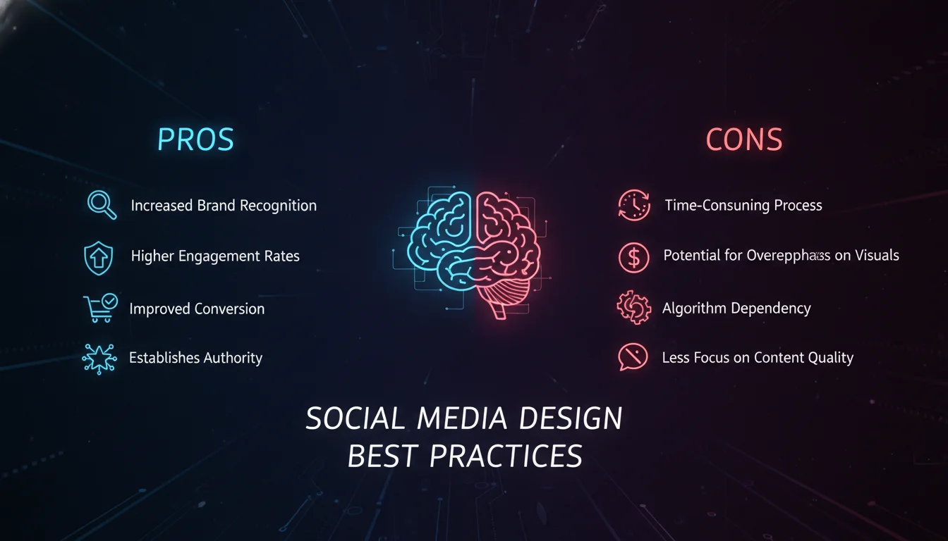
Pros and Cons of Prioritizing Social Media Design
Pros
- Stronger brand recognition: Consistent visual identity makes your brand instantly identifiable across platforms without users needing to read your name.
- Higher engagement rates: Well-crafted visuals stop the scroll and invite interaction, from likes to shares to saves.
- Competitive differentiation: Most brands post. Few brands design with intention. A strong visual system separates you from the noise.
- Scalable content production: A solid design system with templates and brand guidelines lets your team produce quality content faster and more consistently.
- Measurable impact: Unlike many brand investments, social media design performance is trackable through native analytics and third-party tools.
Cons
- Time and resource investment: Building a proper visual system requires upfront design work, whether in-house or through an agency.
- Platform fragmentation: Each platform has different specs, aspect ratios, and content norms. Designing for all of them simultaneously adds complexity.
- Trend fatigue: Visual trends move fast. What looks fresh today can feel dated within months, requiring ongoing design refreshes.
- Risk of over-designing: Too many elements, fonts, or effects can dilute your message and confuse your audience.
Social Media Design Best Practices: The Core Framework

Applying social media design best practices consistently is what separates brands that grow from brands that just post. Here is the framework we use at Emin Media across every client engagement.
1. Know Your Audience Before You Open a Design Tool
Understanding your target audience is the foundation of every design decision. Different demographics respond to different visual languages. A Gen Z audience on TikTok expects raw, kinetic energy. A B2B audience on LinkedIn expects clean, authoritative layouts. Conducting audience research before designing, not after, gives you the insight to make choices that resonate rather than choices that just look good to you.
Start with platform analytics, customer interviews, and competitor visual audits. Then build a one-page visual brief that defines your audience’s aesthetic expectations before a single pixel gets placed.
2. Build a Visual Identity System, Not Just a Logo
Visual consistency across all social media platforms builds brand recognition. Use a cohesive color palette, a defined typography hierarchy, and a consistent imagery style that aligns with your brand identity. This is not about being rigid. It is about being recognizable. Nike does not reinvent its visual language every campaign. It deepens it.
Your visual identity system should include: a primary and secondary color palette, two to three approved typefaces with clear usage rules, an image treatment style (bright and airy, dark and editorial, illustrated, etc.), and a set of approved graphic elements or textures. With this system in place, anyone on your team can produce on-brand content without a designer in the room.
3. Optimize for Each Platform’s Specifications
Each social media platform has distinct requirements for image sizes and formats. Instagram favors square and vertical imagery. Facebook often uses horizontal visuals. LinkedIn has its own dimensions for posts, banners, and article headers. Ignoring these specs means your content gets cropped, distorted, or deprioritized by the algorithm.
As Linearity’s design team notes, staying current with the latest social media dimensions ensures your visuals retain their impact as platforms introduce new content types. Build a platform spec sheet into your design workflow and update it quarterly. This is one of the most overlooked social media design best practices, and one of the highest-leverage fixes available.
“Social media design is a reliable way of providing your audience with an authentic and consistent experience across various platforms.” – AND Academy, Graphic Design Resources, 2025
Design Techniques That Actually Drive Engagement

Strong social media design best practices go beyond brand guidelines. These are the execution-level techniques that separate scroll-stopping content from content that gets ignored.
1. Lead with High-Quality Visuals, Always
High-quality images and graphics are the price of entry. Blurry, pixelated, or poorly lit visuals signal low effort and damage brand credibility instantly. Invest in professional photography for hero content. For everyday posts, use high-resolution stock imagery or well-produced original graphics. The visual quality bar on platforms like Instagram has never been higher, and audiences notice the difference immediately.
2. Use Templates as a Starting Point, Not a Crutch
Design templates significantly streamline content production. Tools like Canva, Adobe Express, and Figma offer customizable templates that maintain brand consistency while allowing creative flexibility. The key word is customizable. A template used straight out of the box looks like every other brand using that template. Adapt it to your visual identity system, and it becomes a production asset that saves hours without sacrificing originality.
3. Make Typography Do the Heavy Lifting
Typography is one of the most underused design tools in social media content. The fonts you choose convey tone before anyone reads a word. As Linearity’s team points out, readability should remain the priority. Fancy fonts catch the eye but lose the message. Strike a balance between aesthetic personality and legibility, especially on mobile screens where text renders small.
Limit yourself to two typefaces per post. Use size contrast to create hierarchy. And never use a font color that blends into the background, no matter how on-trend it looks.
4. Build Visual Narratives, Not Just Pretty Posts
Visual storytelling is one of the most powerful techniques available to social media designers. A single image can stop a scroll. A carousel that tells a story keeps someone engaged for thirty seconds or more. Use a combination of visuals and text to build a narrative arc: problem, insight, resolution. This structure makes content more relatable, more memorable, and more shareable.
Brands like Apple have built entire campaigns around this principle. Their social content rarely explains. It shows. The product is the story, and the design frames it without distraction.
5. Apply Color Theory with Strategic Intent
Color selection goes beyond aesthetics. It is a direct extension of your brand’s essence. As Linearity notes, vibrant reds can radiate youthful energy while soothing blues evoke calm. Carefully aligning your palette with your brand’s personality creates a subconscious connection with your audience. Colors can also convey seasonal themes, celebrate moments, and highlight campaigns, adding depth to your overall marketing strategy.
Maintain a cohesive color palette across all posts. Introduce accent colors intentionally, not randomly. And always check contrast ratios to ensure text remains readable against any background color you use.
“Clarity beats complexity. If people can’t understand the post quickly, simplify it.” – Adobe Express, Social Media Graphics Guide, 2026
Common Mistakes to Avoid in Social Media Design
Knowing the mistakes is just as valuable as knowing the techniques. These are the errors we see most often, even from experienced marketing teams.
1. Overcomplicating the Design
Simplicity is the discipline that most brands struggle with. Overly complex designs, too many fonts, competing colors, cluttered layouts, confuse viewers and dilute the message. Every element in a design should earn its place. If removing it does not hurt the communication, remove it. Clean, focused layouts perform better across every platform and every audience segment.
2. Ignoring Accessibility
Accessible design is not a nice-to-have. It is a responsibility and a reach multiplier. Use alt text for every image. Ensure sufficient color contrast between text and background. Choose legible fonts at appropriate sizes. Caption your videos. These choices make your content inclusive for users with visual or cognitive differences, and they also improve performance with algorithms that reward accessible content.
3. Skipping the Analytics Review
Designing without reviewing performance data is like cooking without tasting. Native analytics on Instagram, LinkedIn, and Facebook show you exactly which posts drove saves, shares, profile visits, and link clicks. Use that data to identify which visual formats, color treatments, and content structures your specific audience responds to. Then do more of what works and less of what does not. This feedback loop is what makes social media design a discipline rather than a guessing game.
4. Designing for the Desktop First
Most social media consumption happens on mobile. Designing on a large monitor and assuming it will translate is a trap. Preview every design on a phone screen before publishing. Check that text is legible at small sizes, that key elements are not cropped by platform UI, and that the overall composition reads clearly on a 6-inch display.
Brand Spotlight: What Great Social Media Design Looks Like in Practice
Examining successful social media design gives us a practical lens on these principles in action. Nike’s social content is a masterclass in visual restraint. Bold typography, minimal copy, high-contrast imagery, and a consistent brand voice that needs no explanation. Apple takes a similar approach: product-forward, white space as a design element, and zero visual noise. Both brands demonstrate that the most effective social media design does not try to say everything. It says one thing, perfectly.
For smaller brands and startups, the lesson is not to copy the aesthetic but to copy the discipline. Pick one message per post. Build a visual system and stick to it. Let the design serve the story, not compete with it. These are the social media design best practices that scale from a solo founder’s Instagram to a global brand’s multi-platform campaign.
If you want to see how we apply these principles for our clients, explore our branding and social media services or read our take on brand strategy and visual identity on the Emin Media blog.
Social Media Content Rules Worth Knowing
Several content frameworks help teams balance design output with strategic intent. The most referenced ones in the industry address the mix of content types rather than visual design specifically, but they inform how you allocate design resources across your content calendar.
The 5-3-2 Rule for Social Media Posts
The 5-3-2 rule suggests that for every ten posts, five should be curated content from external sources, three should be original branded content, and two should be personal or behind-the-scenes content. This balance keeps your feed from feeling like a constant advertisement while still maintaining brand presence. From a design perspective, each content type may require a distinct visual treatment, which is another reason a flexible template system matters.
The 70/20/10 Rule for Social Media
The 70/20/10 rule allocates your content mix as follows: roughly 70% of posts should add value or entertain your audience, about 20% should share ideas or content from others in your space, and around 10% should be direct promotional content. This framework helps prevent over-promotion and keeps your visual design varied enough to sustain audience interest over time.
Social Media Design Tools Worth Using in 2026
As of 2026, the design tool landscape has expanded significantly. Here is a quick reference for teams at different stages.
| Tool | Best For | Skill Level |
|---|---|---|
| Canva | Template-based content, quick turnaround | Beginner to Intermediate |
| Adobe Express | Brand-consistent graphics, Adobe ecosystem users | Beginner to Intermediate |
| Figma | Design systems, team collaboration, custom assets | Intermediate to Advanced |
| Adobe Photoshop | Photo editing, complex compositions | Advanced |
| Linearity Curve | Vector illustration, animated social graphics | Intermediate to Advanced |
Frequently Asked Questions
What is the 5-3-2 rule for social media?
The 5-3-2 rule is a content mix framework suggesting that for every ten posts, five should be curated content from external sources, three should be original branded content, and two should be personal or human-interest content. It helps brands maintain variety and avoid over-promotion while keeping design output manageable and strategically distributed.
What is the 70/20/10 rule for social media?
The 70/20/10 rule divides your content calendar so that roughly 70% of posts add value or entertain, about 20% share ideas from others in your industry, and around 10% are direct promotional content. This ratio keeps audiences engaged over time and prevents your visual design from becoming repetitive or sales-heavy.
What are the most important social media design best practices for small brands?
For small brands, the highest-impact social media design best practices are visual consistency, mobile-first design, and a simple template system. You do not need a large design budget to look professional. You need a defined color palette, two typefaces, and a clear visual hierarchy applied consistently across every post.
How can I optimize my social media graphics for mobile?
Design at the correct platform dimensions from the start, keep text large enough to read on a 6-inch screen, and preview every post on an actual mobile device before publishing. Avoid placing critical text or logos near the edges of the frame, where platform UI elements like profile icons or action buttons may overlap.
How often should I update my social media design approach?
Revisit your visual strategy every three to six months, or whenever you notice engagement declining on content that previously performed well. Major platform updates, seasonal campaigns, and shifts in your audience demographics are all triggers for a design refresh. The goal is evolution, not reinvention. Keep what works and sharpen what does not.
Ready to build a visual identity that actually performs? Contact Emin Media for a free brand consultation and let’s build something bold together.
Enjoyed this article?
Contact Emin Media for a free brand consultation and let's create something amazing together.
Get in TouchRelated Articles
Brand Design Trends 2026: Motion, AI & Imperfection
Explore brand design trends 2026: motion-first identities, AI collaboration, tactile imperfection, and expressive type shaping…
2026 Social Media Design Trends: Human Meets AI
Discover the top social media design trends for 2026: bold type, vibrant color, imperfect authenticity,…