Modern Web Design: Beyond Pretty Pictures to Profit
The Modern Web Design Paradox: Beautiful Sites That Don’t Convert
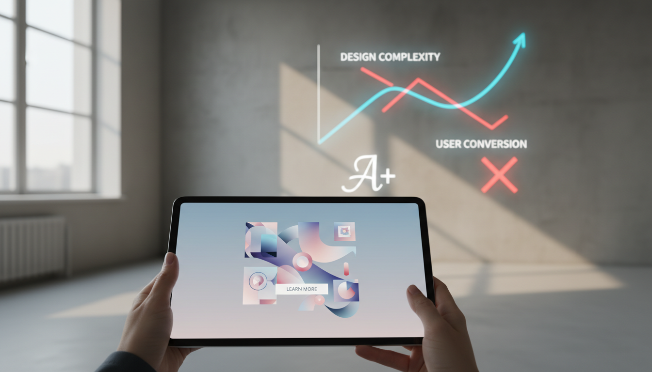
We’ve all been there. You stumble across a website that makes your jaw drop, stunning visuals, buttery-smooth animations, typography that makes you want to frame it. Then you try to actually use the site and realize the designer forgot one tiny detail: people need to accomplish things here.
Modern web design has become obsessed with gallery-worthy aesthetics while forgetting the fundamental truth: your website is a business tool, not a museum piece.
The Instagram Effect on Web Design
Social media has trained us to judge websites like we judge Instagram posts, by how they look in a screenshot. But websites aren’t static images. They’re interactive experiences where real humans try to buy products, book services, or find information.
The most awarded sites often perform terribly in user testing. We’ve seen $50,000 websites that look incredible but convert worse than a basic WordPress template.
What Actually Makes Design ‘Modern’
True modern design isn’t about following the latest visual trends. It’s about understanding how people interact with digital interfaces in 2026. This means designing for thumb navigation, voice search, AI integration, and the reality that most users are multitasking while browsing.
The Performance-Beauty Balance
Modern users expect sites to load in under three seconds, regardless of how many custom animations you’ve added. Google’s Core Web Vitals aren’t suggestions, they’re requirements for ranking well and keeping visitors engaged.
Key Takeaways
- Modern web design prioritizes user experience over visual trends
- Performance and accessibility are non-negotiable in 2026
- The best designs are invisible, users accomplish their goals without friction
- Mobile-first isn’t optional; it’s the baseline expectation
- Conversion optimization should inform every design decision
The Psychology Behind Modern User Expectations

Your website visitors arrive with expectations shaped by Netflix, Amazon, and TikTok. They expect personalization, instant gratification, and interfaces that seem to read their minds.
Attention Spans vs. Information Density
The average user scans a webpage for roughly 15 seconds before deciding whether to stay or leave. This doesn’t mean dumbing down your content, it means organizing information in scannable, digestible chunks.
We use the ‘F-pattern’ reading behavior to structure content: headlines that grab attention, subheadings that guide the eye, and bullet points that deliver key information quickly.
The Paradox of Choice in Navigation
Modern users want options but get overwhelmed by too many choices. The sweet spot is typically 5-7 main navigation items, with clear hierarchies for deeper content.
Progressive disclosure, revealing information gradually as users need it, prevents cognitive overload while maintaining complete functionality.
Emotional Design in Digital Spaces
Colors, typography, and spacing aren’t just aesthetic choices, they’re emotional triggers. Warm colors can increase urgency, while cool tones build trust. The spacing between elements affects how premium or accessible your brand feels.
Essential Elements of Contemporary Web Architecture

Building a modern website is like designing a city. You need clear pathways, logical neighborhoods, and infrastructure that works even when traffic gets heavy.
Mobile-First Architecture
Starting with mobile constraints forces better design decisions. When you have limited screen space, every element must earn its place. This discipline creates cleaner, more focused experiences across all devices.
Touch targets need to be at least 44 pixels for comfortable finger navigation. Text must be readable without zooming. These aren’t mobile-specific requirements, they improve usability everywhere.
Progressive Web App Features
Modern websites blur the line between web and native apps. Push notifications, offline functionality, and app-like navigation create more engaging experiences without requiring app store downloads.
Service workers enable background syncing, so users can start forms offline and submit them when connectivity returns. This level of reliability was impossible just a few years ago.
Accessibility as a Design Foundation
Accessibility isn’t an add-on, it’s a design principle that makes sites better for everyone. High contrast ratios improve readability in bright sunlight. Clear navigation helps users with cognitive differences and busy multitaskers alike.
Screen reader compatibility requires semantic HTML structure, which also helps search engines understand your content better.
Visual Trends That Actually Matter in 2026

Most design trend articles read like fashion magazines, lots of pretty pictures, little practical value. Here are the visual directions that actually impact user behavior and business results.
Purposeful Animation and Micro-Interactions
Animation should guide attention and provide feedback, not just look cool. A button that subtly changes color on hover confirms the user’s action. Loading animations reduce perceived wait time by showing progress.
Micro-interactions, those tiny moments of feedback when users interact with interface elements, build confidence and create emotional connections with your brand.
Typography as Brand Voice
Font choices communicate personality before users read a single word. A tech startup might use clean, geometric sans-serifs to convey innovation, while a law firm chooses traditional serifs to project stability and expertise.
Variable fonts allow fine-tuning of weight, width, and other properties without loading multiple font files, improving both aesthetics and performance.
Color Psychology in Digital Interfaces
Color affects user behavior in measurable ways. Red creates urgency (perfect for sale banners), blue builds trust (ideal for financial services), and green suggests growth or environmental consciousness.
Dark mode isn’t just trendy, it reduces eye strain and saves battery life on OLED screens. Offering both light and dark options shows attention to user preferences.
Performance Optimization as a Design Discipline
Fast websites aren’t just nice to have, they’re business requirements. Amazon found that every 100ms of latency costs them 1% in sales. Google uses page speed as a ranking factor. Your beautiful design means nothing if users leave before it loads.
Image Optimization Strategies
Images typically account for 60-70% of page weight. Modern formats like WebP and AVIF offer better compression than JPEG while maintaining visual quality. Responsive images serve appropriate sizes for different screen densities.
Lazy loading delays image loading until users scroll to them, dramatically improving initial page load times. Critical images above the fold should load immediately, while below-the-fold content can wait.
Code Efficiency and Resource Management
Clean, efficient code isn’t just developer preference, it directly impacts user experience. Minified CSS and JavaScript files load faster. Unused code bloats file sizes without adding value.
Content Delivery Networks (CDNs) serve static assets from servers geographically closer to users, reducing load times regardless of where your main server is located.
Performance Monitoring and Optimization
Real User Monitoring (RUM) shows how your site actually performs for real visitors, not just in controlled testing environments. Core Web Vitals, Largest Contentful Paint, First Input Delay, and Cumulative Layout Shift, measure user experience quality.
Performance budgets set limits on file sizes and load times, preventing feature creep from degrading user experience over time.
User Experience Design Beyond the Interface
Great UX design extends beyond visual interfaces into content strategy, user flows, and the entire customer journey. It’s about understanding what users are trying to accomplish and removing every possible barrier.
Content Strategy as UX Design
Content isn’t separate from design, it is design. The words on your site guide users through their journey, answer questions, and build confidence in your brand.
Scannable content uses headings, bullet points, and short paragraphs to accommodate how people actually read online. Important information appears early, with supporting details available for users who want to dig deeper.
Conversion-Focused User Flows
Every page should have a clear primary action and remove distractions from that goal. Contact forms should ask for only essential information. Checkout processes should minimize steps and offer guest options.
A/B testing different user flows reveals what actually works versus what we think should work. Small changes, like button color or form field order, can significantly impact conversion rates.
Personalization and Dynamic Content
Modern users expect experiences tailored to their needs and behavior. This doesn’t require complex AI, simple personalization like showing relevant content based on referral source or previous visits can improve engagement.
Dynamic content keeps sites fresh and gives users reasons to return. This might be updated portfolio pieces, rotating testimonials, or location-specific information.
Technical Implementation of Modern Design Principles
Beautiful designs need solid technical foundations. The best visual concepts fail without proper implementation, while technically sound sites can succeed even with modest aesthetics.
Responsive Design Beyond Screen Sizes
True responsive design adapts to more than screen dimensions. It considers connection speed, input methods (touch vs. mouse), and user context (mobile users are often multitasking or in motion).
Container queries allow components to respond to their parent element’s size rather than the viewport, enabling more flexible layouts that work in various contexts.
Modern CSS Techniques
CSS Grid and Flexbox enable complex layouts without the hacks and workarounds of previous eras. These tools create responsive designs that adapt naturally to different screen sizes and content lengths.
CSS custom properties (variables) make maintaining consistent design systems easier and enable dynamic theming without JavaScript.
JavaScript Enhancement Strategies
Progressive enhancement ensures core functionality works without JavaScript, then adds enhanced experiences for capable browsers. This approach improves accessibility and performance while supporting the widest range of users.
Modern JavaScript frameworks like React, Vue, or Svelte can create app-like experiences, but they should enhance rather than replace good fundamental web practices.
| Design Approach | User Impact | Business Impact | Implementation Complexity |
|---|---|---|---|
| Mobile-First Design | Smooth cross-device experience | Higher mobile conversion rates | Medium |
| Performance Optimization | Faster loading, less frustration | Better SEO, lower bounce rates | High |
| Accessibility Focus | Inclusive for all users | Larger addressable market | Medium |
| Progressive Web App | App-like functionality | Increased engagement | High |
| Personalization | Relevant, tailored content | Higher conversion rates | Medium to High |
Measuring Success in Modern Web Design
Design decisions should be based on data, not opinions. The most beautiful website in the world is worthless if it doesn’t accomplish business goals or serve user needs effectively.
Key Performance Indicators That Matter
Conversion rate is the ultimate measure of design effectiveness, but it’s not the only metric that matters. Time on page, bounce rate, and user flow completion rates provide insights into how well your design guides users toward their goals.
Heat maps and user session recordings reveal how people actually interact with your design, often showing gaps between intended and actual user behavior.
A/B Testing Design Elements
Testing different design approaches with real users provides objective feedback on what works. This might involve testing button colors, headline copy, or entire page layouts to optimize for specific goals.
Statistical significance requires adequate sample sizes and testing duration. Quick tests with small sample sizes often produce misleading results that can hurt rather than help performance.
Long-Term Design Performance
Great design maintains effectiveness over time rather than requiring constant updates to chase trends. This means building flexible systems that can evolve with changing needs rather than rigid layouts that become outdated quickly.
Regular design audits identify areas where user behavior has changed or where new opportunities exist to improve performance.
“The best design is invisible. When users can accomplish their goals without thinking about your interface, you’ve succeeded. When they notice your design more than their results, you’ve failed.”
Modern web design isn’t about following the latest trends or winning design awards. It’s about creating digital experiences that serve real human needs while achieving measurable business results. The most successful websites balance aesthetic appeal with functional excellence, creating experiences that users love and businesses can measure.
Ready to transform your website from pretty picture to profit driver? Contact Emin Media for a free brand consultation and discover how strategic design thinking can revolutionize your digital presence.
Enjoyed this article?
Contact Emin Media for a free brand consultation and let's create something amazing together.
Get in Touch