Brand Identity Design Trends 2026: Bold Moves
Key Takeaways
- 2026’s defining tension is AI polish versus human imperfection, not a single dominant style.
- Motion-first systems have shifted from optional flourish to core brand asset.
- Hand-crafted textures, grain, and uneven lines signal authentic human creativity.
- Expressive typography now carries brand personality as the hero element.
- Agenda branding, sensory cues, and total branding extend identity beyond visuals.
- Strategic trend adoption outperforms chasing every visual shift.
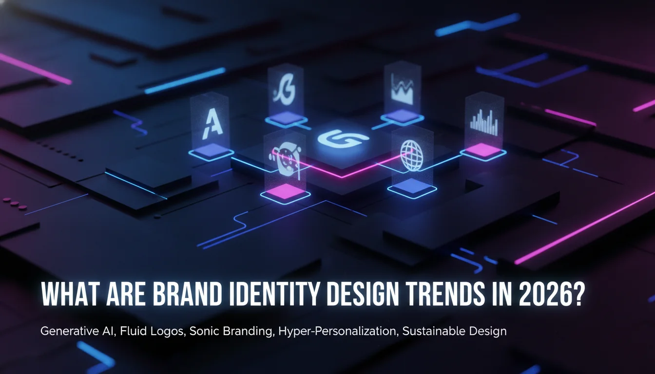
Brand identity design trends are the visual and strategic patterns shaping how brands express themselves across logos, motion, type, and messaging in 2026, with motion-first systems, hand-crafted imperfection, and AI-aware authenticity leading the charge.
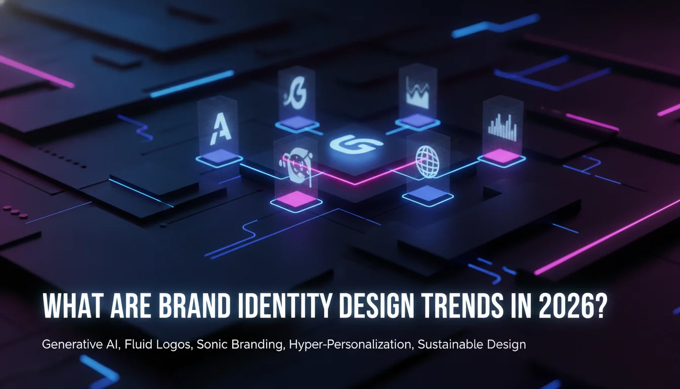
What Are Brand Identity Design Trends in 2026?
Defining Brand Identity Design Trends
design trends are the recurring visual and strategic patterns that determine how brands show up across logos, typography, color, motion, and messaging. According to the Adobe Certified Professional team, brand identity encompasses logos, typography, color palettes, taglines, and imagery, each contributing to consumer recognition. The trends are the directional shifts within those elements. In 2026, those directions are unusually diverse and, frankly, more exciting than they’ve been in years.
LogoLounge’s 2026 Logo Trend Report describes the year as one of experimentation, while Envato’s logo and branding trends overview argues that branding goes multi-dimensional and multi-media. These sources agree on one thing: the era of the static, skin-deep logo is over. this type of trends in 2026 demand that every mark, motion, and message work harder.
Why 2026 Is a Pivot Point
Several forces converge this year. AI tools have matured, TikTok and short-form video dominate attention, and experiential marketing reconstructs what a brand can be. Envato calls the atmosphere a “Wild West” in which cultural events, movies, and viral moments can become brand-defining touchstones overnight. Threerooms frames the shift as a response to an AI-driven digital landscape: screens are now the primary point of brand interaction, so static visuals struggle to hold attention.
This pivot has real consequences. A brand that ignores motion, texture, or agenda may look flat next to competitors whose identities move, speak, and take positions. At the same time, audiences have grown skeptical of overly polished, AI-generated imagery. The result is a push-pull: brands want the speed and scale of AI, but they also need the visible fingerprints of human craft to stay trustworthy.
Where Sources Disagree on the Direction
The 2026 trend lists don’t perfectly align. Threerooms leads with motion-first identities and humanised hybrid intelligence, while Envato foregrounds kinetic logos, childlike anarchy, agenda branding, authenticity, sensory branding, and AI-assisted design. VistaPrint’s 10 logo design trends names Storybook Gothic, Pixel Sharp, Little Blip Logos, Toasty Logos, Stamp and Seal, and Morph as distinctive niches. These differences matter because they show that no single list is canonical. Each source slices the same cultural moment differently.
The most productive reading is to treat the overlap as the signal. Motion, human imperfection, expressive type, and AI-aware authenticity appear across multiple sources. Where sources disagree, brands should test relevance against their own audience rather than blindly adopting a label.
Pros and Cons of Following Brand Identity Design Trends
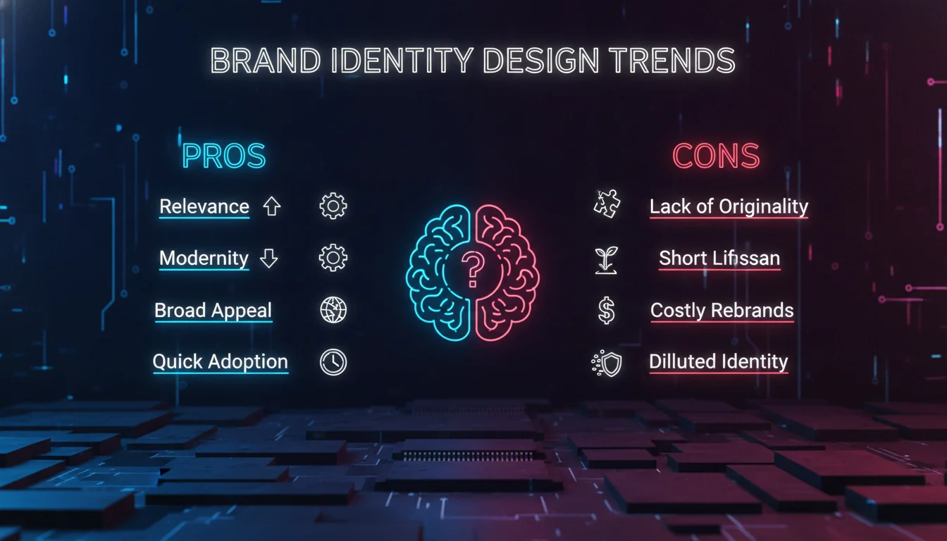
Pros
- Cultural relevance: Aligning with current this kind of design trends keeps your visual language in sync with how audiences consume and respond to brands today.
- Competitive differentiation: Brands that adopt motion, expressive type, or sensory cues stand out against competitors still relying on static, generic marks.
- Audience connection: Trends like hand-crafted imperfection and agenda branding build emotional resonance that purely functional design cannot achieve.
- AI efficiency gains: Hybrid AI-plus-human workflows let studios produce more variations, faster, without sacrificing strategic intent.
- Future-proofing: Motion-first and multi-sensory systems are built for the screen environments that will only grow in importance.
Cons
- Trend shelf life: Niche styles like Storybook Gothic or childlike anarchy may feel dated within two to three years, requiring costly refreshes.
- Incoherence risk: Adopting too many the identity design trends at once without a unifying strategy produces visual noise, not a brand.
- Execution cost: Motion-first systems and custom typography require significantly more production investment than a static logo suite.
- Authenticity mismatch: Agenda branding backfires when a brand’s public stance doesn’t match its actual operations or values.
Motion-First Identities: The Core 2026 Shift
From Static Logos to Kinetic Systems
Motion-first identity is a brand system in which animation, kinetic typography, and dynamic behavior are core components, not optional add-ons. This is one of the brand identity design trends with the clearest structural logic behind it. Threerooms states that motion is becoming just as essential as colour palettes and typefaces, and that movement communicates tone, pace, and attitude. In screen-led environments, a logo that never moves can feel unfinished by comparison.
LogoLounge’s 2024 report already noted that logos were getting boxed, chopped, dropped, liquified, and sticker-ified in the name of experimentation. The 2026 continuation is more deliberate: brands are building motion systems that adapt to context, including animated logos, motion-led UI behavior, kinetic typography, and dynamic systems that change with the user’s environment or content.
How Brands Use Motion in Practice
Practical applications include animated logo reveals on websites and apps, kinetic typography in video ads, and interface behaviors that respond to scrolling or interaction. Motion is no longer a final polish. It’s designed into the identity from the start, which is exactly why the term “motion-first” has replaced “motion add-on.” A brand’s movement should express characteristics, such as speed, warmth, precision, or playfulness, that printed form simply cannot convey.
For B2B brands especially, motion can humanise complex services. A subtle loading animation or a kinetic wordmark can make a software company feel more responsive and less sterile. Threerooms links this directly to how B2B marketing leaders are building their brands with video, which signals that motion-first thinking extends well beyond consumer logos into broader brand strategy.
Expert Insight: Motion as a Core Brand Asset
“Storybook Gothic is resonating right now because it taps into a collective craving for mystery, meaning and escape. For small businesses, it’s a way to design a logo that doesn’t just identify your brand but creates a story customers can connect with instantly.”
– Patrick Llewellyn, VP, Digital and Design Growth, VistaPrint
The underlying logic here applies directly to motion-first design. Motion creates a story-like sequence: a logo can unfold, react, or surprise. That kind of narrative depth turns a mark into an experience. In a feed full of static images, a brief motion signature can be the difference between being scrolled past and being remembered.
“With screens now the primary point of brand interaction, static visuals alone struggle to hold attention. Motion now acts as a core brand asset, not an afterthought.”
– Threerooms, 8 Design Trends Shaping Brand Identity in 2026
Hand-Crafted Imperfection and Tactile Textures
The Authenticity Counter-Movement
Hand-crafted imperfection is one of the brand identity design trends that directly answers AI saturation. It’s a design approach that deliberately incorporates uneven lines, grain, and tactile textures to signal human authorship. Threerooms observes that as AI-generated visuals become more polished, brands are embracing the opposite: visible human nuances that signal authenticity and a more personable touch. This isn’t a rejection of digital tools. It’s a strategic balancing act.
VistaPrint’s round-up reinforces this, noting that in a world full of slick, samey logos, the brands winning attention feel personal, tactile, and human. The emphasis is on clear, simple designs that are unmistakably yours, not perfectly polished sameness. Hand-drawn uneven lines, brush strokes, scribbles, subtle grain overlays, and blemishes become assets rather than defects.
Visual Signatures of Human Craft
Common visual signatures include imperfect shapes that soften digital sleekness, grain overlays that mimic print or film, and lettering with slightly wonky baselines. These touches build emotional connection because they express warmth and individuality in an increasingly automated world. They also create a subtle proof of work: if an image has a hand-drawn wobble, it’s far less likely to be mistaken for a wholly AI-generated asset.
This trend doesn’t mean abandoning clarity. VistaPrint advises prioritising clear, simple designs with selective details. The imperfection should be intentional, not chaotic. A logo that’s entirely messy may fail legibility tests, but one that pairs a clean wordmark with a hand-drawn icon or a grainy texture can feel both professional and human.
Where Tactile Textures Work Best
Tactile textures are particularly effective for craft beverages, indie beauty, bookshops, tattoo studios, boutique events, and any brand whose value proposition depends on provenance, heritage, or artisanal quality. In these categories, a too-clean mark can feel generic or corporate. A slightly rough edge or paper-like grain signals that the product was made by hands, not machines.
For larger B2B or technology brands, the same tactic works sparingly: a grainy photograph in an annual report, a hand-drawn annotation in an interface, or a custom illustration that isn’t perfectly vector-smooth. The goal is to inject the right amount of human presence without undermining trust or scalability.
Expressive Typography as Identity
Typography Moves from Supporting Role to Hero
Expressive typography is among the most visible brand identity design trends for 2026. It’s the use of custom letterforms, playful character shapes, and typographic wordmarks as the primary identity element. Threerooms describes typography evolving from a functional necessity to the hero of brand personality. Brands seek instantly recognisable visual tone, and custom type provides a way to differentiate in saturated markets.
In 2026, this trend appears in bespoke letterforms, kinetic type that moves, and wordmarks full of personality. A logotype is no longer just a container for a brand name. It is the identity. This is especially visible in fashion, media, and lifestyle brands, where a distinctive typeface can become as recognisable as any symbol.
Custom Letterforms and Character
Custom type offers two clear advantages. First, it’s ownable: a bespoke typeface can’t be easily copied or licensed by competitors. Second, it carries tone. A rounded, slightly irregular letter suggests approachability, while a precise, angular cut suggests engineering precision. VistaPrint’s Storybook Gothic trend, for example, uses blackletter or gothic-inspired type paired with a clean sans serif for legibility, creating an atmospheric, story-led feel that works beautifully for craft and lifestyle brands.
Designers should be cautious, though. Expressive type must still perform across sizes and contexts. A highly ornate wordmark may be beautiful on a poster but illegible at 16 pixels in an app icon. The strongest 2026 type systems are flexible: a display version with character, and a functional version for body text and interfaces.
Typography Trends Across Sources
LogoLounge’s historical trend reports show a clear pendulum: 2018 swung toward curvy and retro, 2017 was simplicity, stripes, and geometry, 2016 was simplicity as king. In 2026, the pendulum has moved toward character and narrative. Envato notes that a wave of 1980s type tributes emerged from the aesthetic influence of major film releases, demonstrating how cultural moments translate directly into typographic choices.
This cultural responsiveness is why typography isn’t just a design detail. When a typeface references a specific era, genre, or subculture, it imports that meaning into the brand. Brands adopting expressive typography should ask which cultural references align with their own story, rather than borrowing a trend simply because it’s popular.
Niche Logo Styles Worth Knowing in 2026
Storybook Gothic, Pixel Sharp, and Beyond
Beyond the macro brand identity design trends, VistaPrint’s research surfaces several niche logo styles that are gaining traction with small and mid-sized brands. Each one reflects a distinct cultural appetite.
Storybook Gothic channels folklore and fantasy with moon phases, enchanted flora, mythic creatures, and gothic or blackletter typography. It works for craft beverages, indie beauty, bookshops, and boutique events where a logo that feels like a talisman sparks curiosity and premium perceived value.
Pixel Sharp leans into digital-native aesthetics, referencing early computer graphics and gaming culture. It resonates with tech-adjacent brands and audiences who grew up with screens as their primary creative canvas.
Little Blip Logos are minimal, almost icon-sized marks that prioritise recognisability at small scale, built for app icons, favicons, and social profile images where a complex mark simply disappears.
Toasty Logos use warm, earthy palettes and rounded forms to communicate comfort and approachability, a direct visual response to the cold, clinical aesthetic that dominated tech branding for the previous decade.
These niche styles are not universal prescriptions. They’re signals of specific audience appetites. The question for any brand is whether the appetite matches the people they’re actually trying to reach.
How AI Is Shaping Brand Identity Design Trends
AI’s Role in the 2026 Landscape
AI-assisted brand design is the use of machine learning tools to generate, iterate, or refine brand assets while human oversight shapes final strategy. Envato includes AI-assisted brand design as one of the core brand identity design trends for 2026, noting that AI has “ripped up the rulebook” and is becoming increasingly effective at winning over audiences. LogoLounge’s trend reports have tracked AI’s evolution since at least 2023, when the year was described as a whirlwind of ideas, symbols, and AI.
The challenge isn’t whether to use AI. It’s how to use it without erasing the brand’s humanity. Polished AI outputs can look impressive, but they often lack the subtle imperfections and strategic intent that make an identity feel believable. This is why hand-crafted imperfection and AI-assisted design are rising simultaneously. They’re two sides of the same coin.
The Hybrid Approach: Empathy Over Efficiency
Threerooms calls this “humanised hybrid intelligence,” noting that with AI now a core part of daily workflows, design focus is shifting from efficiency to empathy. The opportunity is to let AI handle repetitive tasks, such as generating variations, resizing assets, and testing colour combinations, while humans make the taste, narrative, and ethical decisions. A hybrid workflow can be faster without being generic, as long as the final output carries a clear point of view.
According to the Adobe Certified Professional team, understanding the brand and its competition is foundational to any identity process. AI can assist with analysis and generation, but it cannot conduct a meaningful client interview or understand the cultural nuance of a market. The human role expands rather than shrinks.
A Feature Comparison: AI-Assisted vs Human-Led Brand Identity
The table below summarises the qualitative differences that emerge from the 2026 trend sources. It’s a decision aid for where each approach fits, not a ranking.
| Approach | Visual Polish | Speed | Authenticity Cues | Emotional Resonance | Best Use Cases |
|---|---|---|---|---|---|
| AI-Assisted Brand Identity | High, consistent | Fast | Often low without human editing | Can feel generic if unedited | Iteration, layout variations, preliminary concepts |
| Human-Led Brand Identity | Variable, may be intentionally imperfect | Slower | High, visible craft | Strong when strategy is clear | Core brand story, custom type, final identity systems |
| Hybrid Approach | High, with intentional texture | Moderate to fast | Moderate to high, depends on oversight | Strong when human point of view guides AI output | Scalable brand systems, motion assets, multi-channel campaigns |
This table is based on qualitative reading of Threerooms, Envato, and Adobe sources. No numeric benchmarks are included because none of the competitor content provides them.
Agenda Branding, Sensory Branding, and Total Branding
Agenda Branding: When Brands Take a Stand
Agenda branding is a strategy in which a brand publicly aligns with cultural or social positions to build meaning beyond product attributes. Envato identifies agenda branding as a major 2026 direction, driven by the collision of culture and corporations on social media. When a brand takes a clear stance through an ad campaign, a sponsorship, or a public statement, it can attract like-minded customers. It also risks alienating others.
The key, according to Envato, is that the most successful brand identity in 2026 goes further than skin-deep, building narrative, opinion, and aesthetic into one compelling package. Agenda branding is not the same as performative activism. Audiences quickly punish brands whose actions don’t match their words, which is why this direction demands strategic alignment across product, operations, and communications.
Sensory Branding: Sound, Texture, Movement
Sensory branding is the integration of non-visual cues such as sound, texture, and movement into the brand experience. Among the brand identity design trends Envato highlights, sonic branding and motion logos stand out as ways to boost the sensory appeal of campaigns. A brand can now have an audio logo, a tactile packaging finish, or a kinetic behavior that appears when a user opens an app. These multi-sensory elements make the brand more memorable because they engage more than just the eyes.
This trend connects directly to motion-first identities and hand-crafted imperfection. A grainy texture is a visual cue, but it also implies a tactile sensation. A sonic logo is not visual at all, yet it can be as recognisable as a wordmark. Brands that treat identity as a single static mark are leaving significant attention on the table.
Total Branding: Every Moment as a Touchpoint
Total branding is an approach where any online or real-life moment can become a brand-defining touchstone. Envato describes the rise of total branding as one of the defining brand identity design trends of 2026, in which a viral influencer review, a sports event, a movie release, or a local moment can shape how audiences perceive a brand. This is the structural consequence of TikTok and reels, where context collapses and a small business can become a global case study overnight.
The implication is that brand identity design can no longer be limited to a logo suite and guidelines. It must account for how the brand appears in screenshots, reaction videos, user-generated content, and unexpected cultural contexts. A flexible system, including modular logos, motion behaviors, and tone-of-voice guidance, enables a brand to remain coherent while adapting to the moment.
How to Apply Brand Identity Design Trends in 2026: A Step-by-Step Process
The Sequence at a Glance
Applying brand identity design trends strategically requires a process, not just a mood board. The following steps synthesise guidance from Adobe’s six-step brand identity design process and the 2026 trend sources.
- Step 1: Audit your current brand identity against the 2026 landscape.
- Step 2: Select trends strategically, not decoratively.
- Step 3: Implement, test, and refine across real touchpoints.
Step 1: Audit Your Current Brand Identity
Start by understanding the nature of your brand. The Adobe Certified Professional team recommends conducting thorough interviews to understand mission, values, history, and future goals. Then examine your existing identity, including logo, typography, colour, imagery, motion, and tone, against the current brand identity design trends. Ask: Does my brand feel static in a motion-first environment? Does it look overly polished in a moment that rewards human imperfection? Does it have a point of view beyond its product?
This audit should also include competitor analysis. Look at competitors’ brand identities to find common design approaches and opportunities for differentiation. The Brand Identity platform and LogoLounge are useful references for seeing what top studios are producing right now.
Step 2: Select Trends Strategically, Not Decoratively
Not every trend fits every brand. A law firm may need a restrained version of handmade texture, while a craft brewery can embrace full-on Storybook Gothic. The selection criterion isn’t “what is trending” but “what is true to the brand’s story and audience.” Threerooms links this to the idea that your brand already has a story. The trend should amplify that story, not replace it.
A B2B software company might adopt motion-first interfaces and expressive wordmark typography, but skip childlike anarchy. A direct-to-consumer beverage brand might prioritise sensory packaging and total-branding moments. The point is strategic coherence: every chosen trend should reinforce the same brand idea.
Step 3: Implement, Test, and Refine
Implementation begins with small, high-visibility touchpoints. Update the logo animation on your website, add a hand-drawn element to social templates, or redesign one product label with tactile cues. Test how audiences respond. Because 2026 brand identity design trends are multi-dimensional, feedback shouldn’t be limited to static approval meetings. Observe the brand in motion, in thumbnails, in audio, and in user-generated contexts.
Refine based on performance and cultural relevance. LogoLounge’s historical reports remind us that trend reports are as much a study of the past twelve months as a forecast. A brand that treats its identity as a living system, periodically reviewed rather than locked in a PDF, will adapt more successfully than one that chases every new label.
Building a Brand Identity That Outlasts Trends
Synthesizing the 2026 Landscape
The brand identity design trends of 2026 are not a menu of styles to copy. They’re signals of a deeper shift. Motion-first systems, hand-crafted imperfection, expressive typography, AI-assisted design, agenda branding, sensory branding, and total branding all point to the same conclusion: identity must now work across time, touchpoints, and senses. A static logo on a white background is no longer a sufficient representation of a brand.
The Risk of Trend-Chasing
The biggest risk is treating these trends as a checklist. A brand that adopts a kinetic logo, grain texture, and a controversial stance without first understanding its own story will feel incoherent. Sources including Adobe and Threerooms consistently return to strategy: understand the brand, understand the competition, define positioning, and then choose the visual expressions that reinforce that foundation. Trends are tools, not identities.
What Endures Beyond the Hype
What endures is clarity, consistency, and genuine relevance to the people you serve. The brands that win in 2026 are those that use motion to express their character, use imperfection to prove their humanity, use type to speak with a unique voice, and use AI to scale without losing their soul. That’s the real brand identity design trend worth following.
Ready to build something that lasts? Contact Emin Media for a free brand consultation and let’s shape an identity that moves, resonates, and endures.
Frequently Asked Questions
What are the 5 P’s of brand identity?
The 5 P’s of brand identity are a strategic framework for aligning a brand’s core elements. While the precise labels vary by source, they commonly include purpose, promise, personality, positioning, and presentation. Treat them as a checklist for ensuring your visual identity is anchored in strategy, not just aesthetics.
What is the 3 7 27 rule of branding?
The 3 7 27 rule does not appear in the 2026 trend reports reviewed here, so treat any specific breakdown with caution. The underlying principle is that brand recognition builds through repeated, consistent exposure across multiple channels and touchpoints. In practice, this means your brand identity must be recognisable quickly, repeatable, and consistent across every environment.
What are 2026 design trends?
2026 design trends include motion-first identities, hand-crafted imperfection, expressive typography, humanised hybrid intelligence, agenda branding, sensory branding, and total branding. Sources such as LogoLounge, Envato, Threerooms, and VistaPrint each emphasise a slightly different mix, but the common thread is a move beyond static, skin-deep visuals toward brand identity design trends that engage multiple senses and cultural moments.
What are the new design trends for 2026?
New for 2026 are the convergence of kinetic logos, childlike anarchy, Storybook Gothic, Pixel Sharp, and AI-assisted brand design. These trends reflect cultural influences from major films, TikTok aesthetics, and a growing desire for both fantasy and authenticity. The newest edge is the deliberate pairing of AI speed with human imperfection.
Which brand identity design trends are most durable?
Motion-first systems and expressive typography are likely the most durable because they address structural changes in how audiences consume media. Hand-crafted imperfection may evolve as AI detection improves, but the need for authentic human cues won’t disappear quickly. Niche styles like Storybook Gothic may pass, but the underlying desire for story and meaning is lasting.
How do I balance AI-generated design with authenticity?
Use AI for iteration, layouts, and preliminary concepts, then apply human oversight for narrative, taste, and final execution. Add deliberate imperfections, custom type, or motion behaviors that AI would not choose on its own. Threerooms frames this as humanised hybrid intelligence: efficiency without losing empathy.
Enjoyed this article?
Contact Emin Media for a free brand consultation and let's create something amazing together.
Get in Touch